Motorcycle Navigation Experience
GO RIDE
I designed a mobile navigation experience crafted specifically for motorcycle riders, focusing on intuitive route discovery and a premium-tier strategy. The features I designed became the most-used capability in the app, while improvements to onboarding reduced drop-off by 15%, directly supporting engagement and long-term adoption.
UI & UX
Freemium strategy
IOS & Android

Project Overview
Company: GO Ride - TomTom
Industry: Location & Navigation technology
Timeline: 2 years (2022 - 2024)
My Role: Product Designer
I worked as one of three product designers on GO Ride, a mobile navigation app designed specifically for motorcycle riders. I owned end-to-end UX for core ride features and the monetization experience, while co-owning the design system to ensure visual consistency, reusable components, and faster delivery across the app.
GO Ride helped riders plan, save, and repeat great routes, and later became the technical and design foundation for TomTom’s next flagship mobile navigation app.
Context
GO Ride was built as a niche navigation product for motorcycle riders, focused on route discovery, planning, and reusability. Unlike general-purpose navigation apps, its value lay in helping users find enjoyable rides rather than the fastest route from A to B.
The project ran for approximately 1.5 years and was developed within TomTom’s broader navigation ecosystem, balancing user needs, business goals, and a growing focus on scalable systems.
My Role
As one of three product designers, I:
Owned end-to-end UX for several core features
Led UI and design system work across the app
Designed and shipped the monetization and paywall strategy
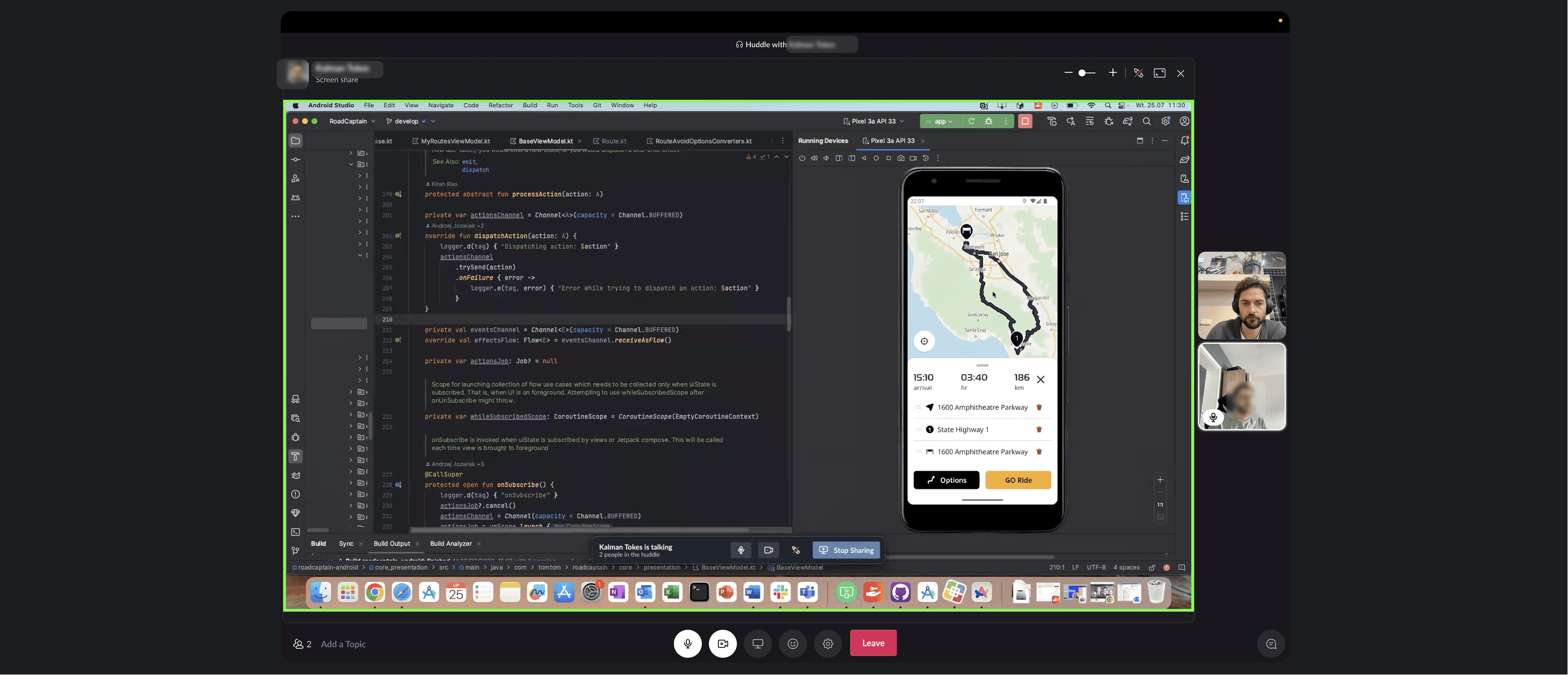
Collaborated closely with PMs, engineers, researchers, growth, marketing, and senior stakeholders
My work focused on creating rider-centric experiences while ensuring the product could scale technically and commercially.
Phase 1 — Defining core rider value
Goal: Help riders easily create, save, and reuse great routes.
I focused on designing features that supported the full riding loop: discovery, planning, riding, and returning. Every feature was built using the shared design system we co-created, ensuring consistency and faster iteration.
Key contributions included:
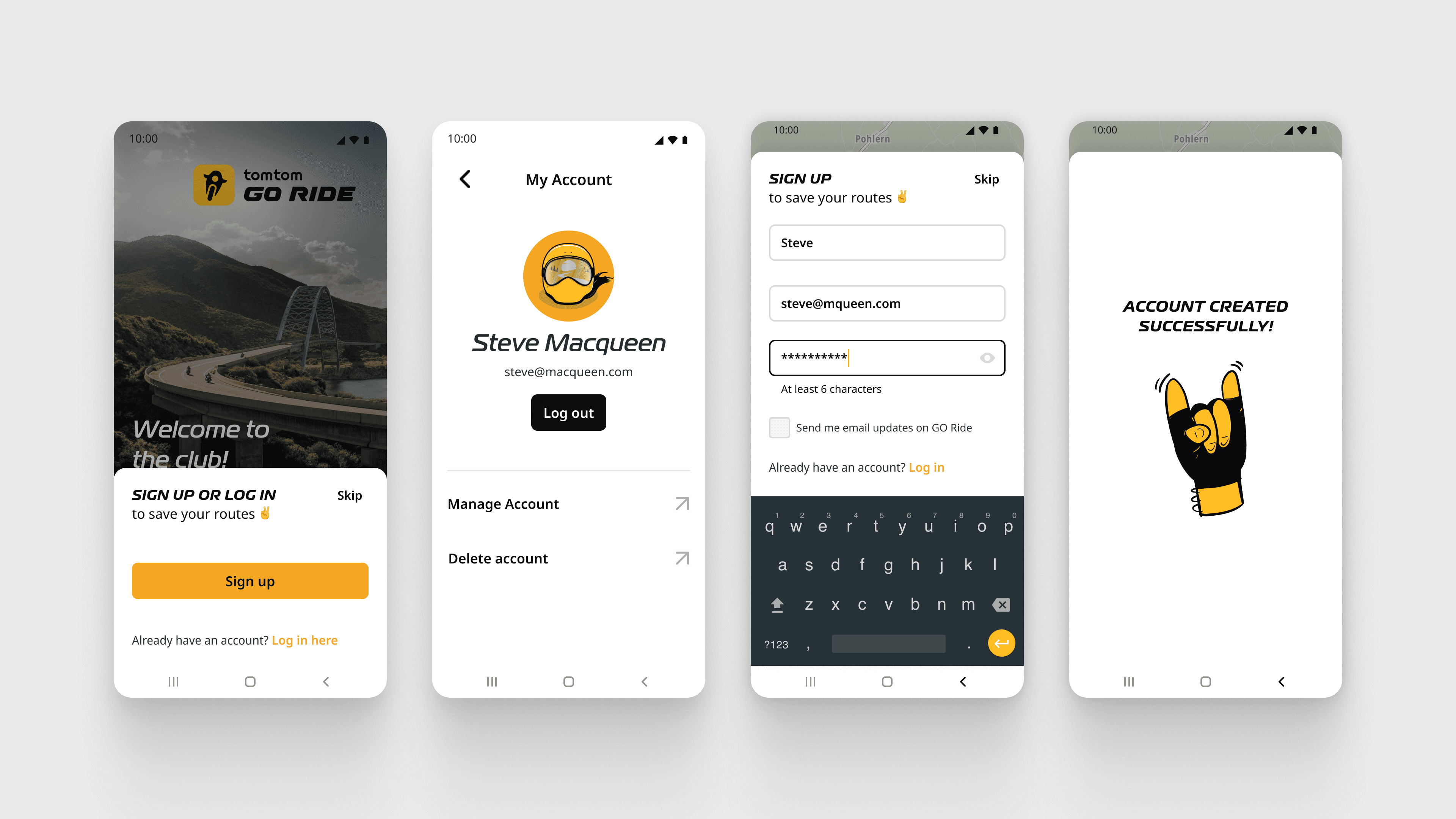
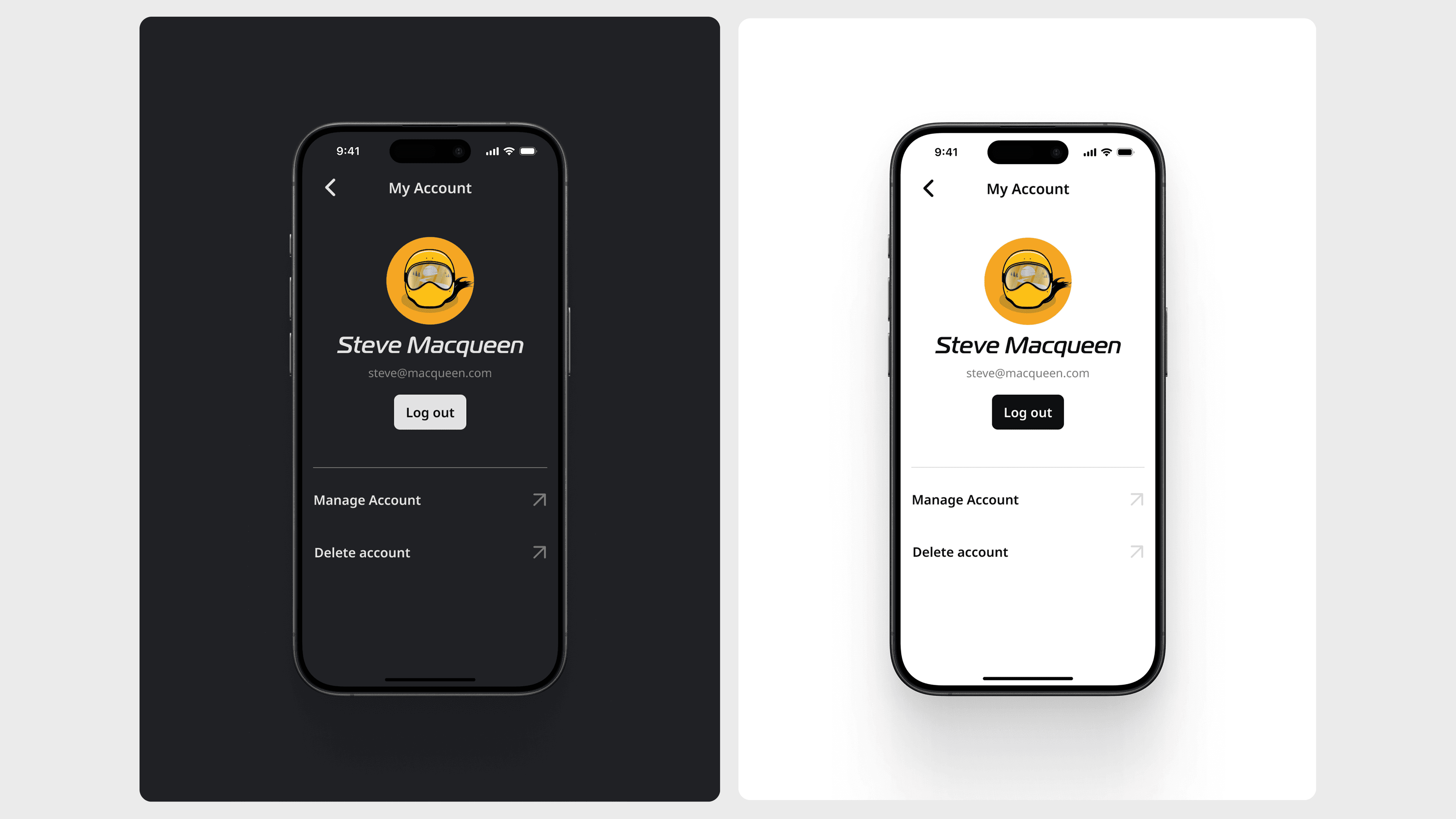
User profiles & saved routes
I designed the user profile experience to give riders a clear overview of their riding history and fast access to saved routes.
A key insight was that riders cared more about saving entire routes than individual locations, as well as importing and exporting routes from other tools, this became a core differentiator for the product.
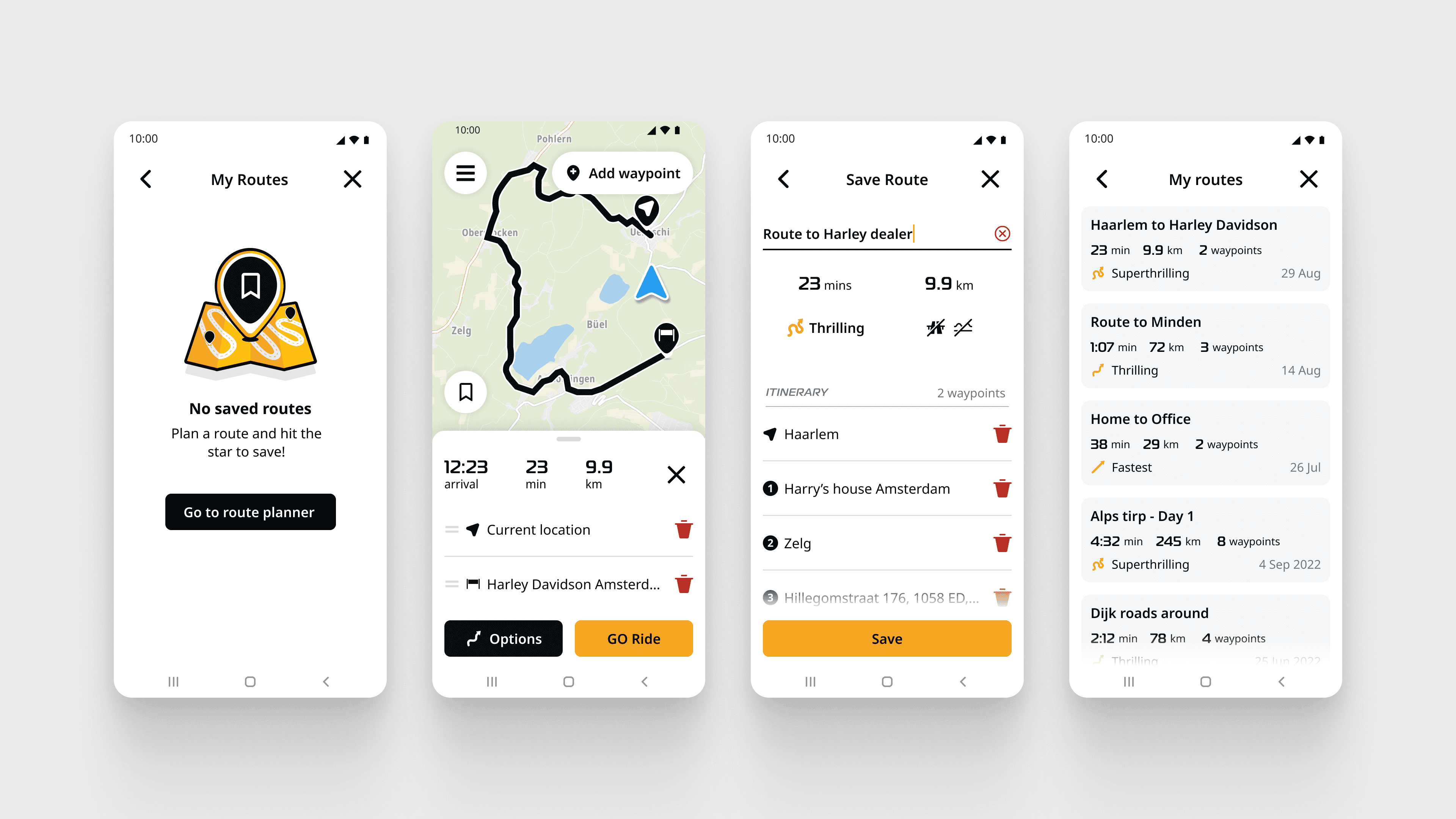
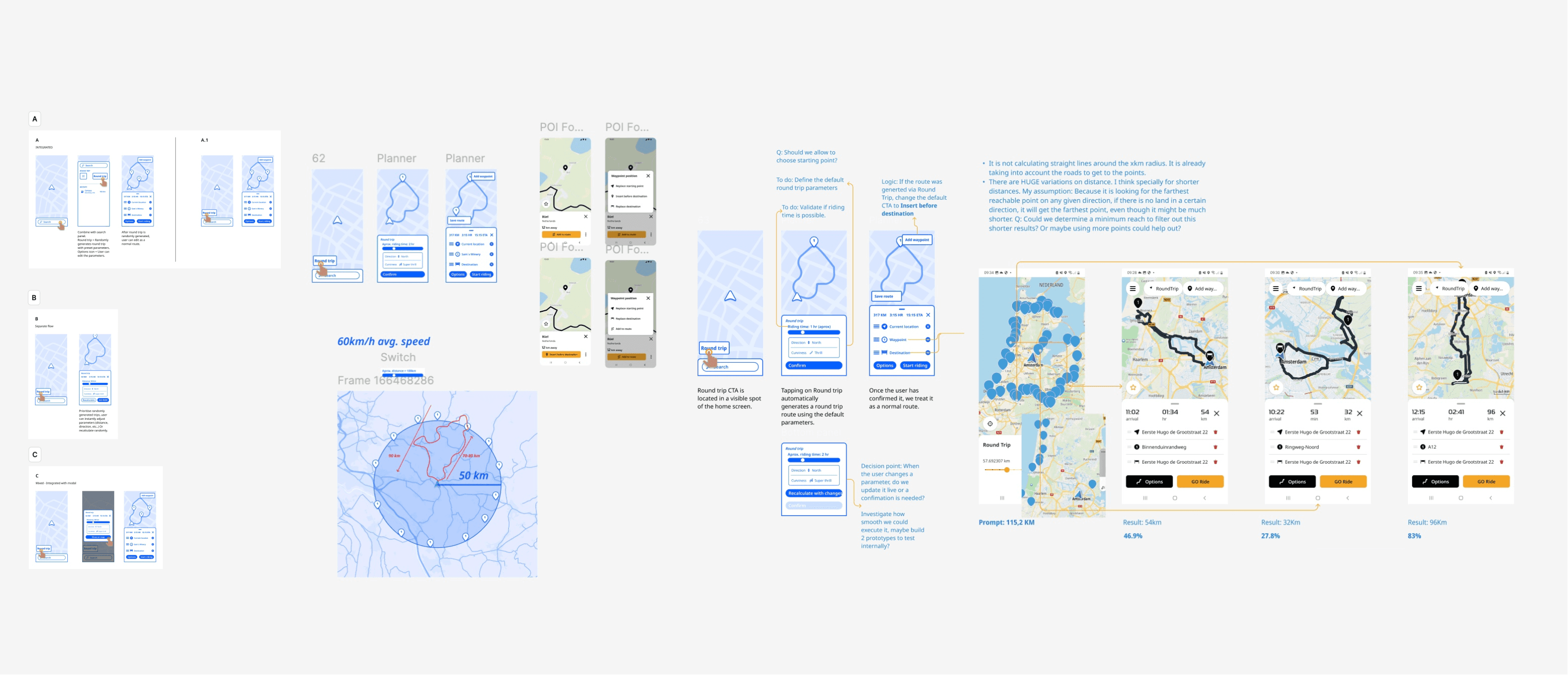
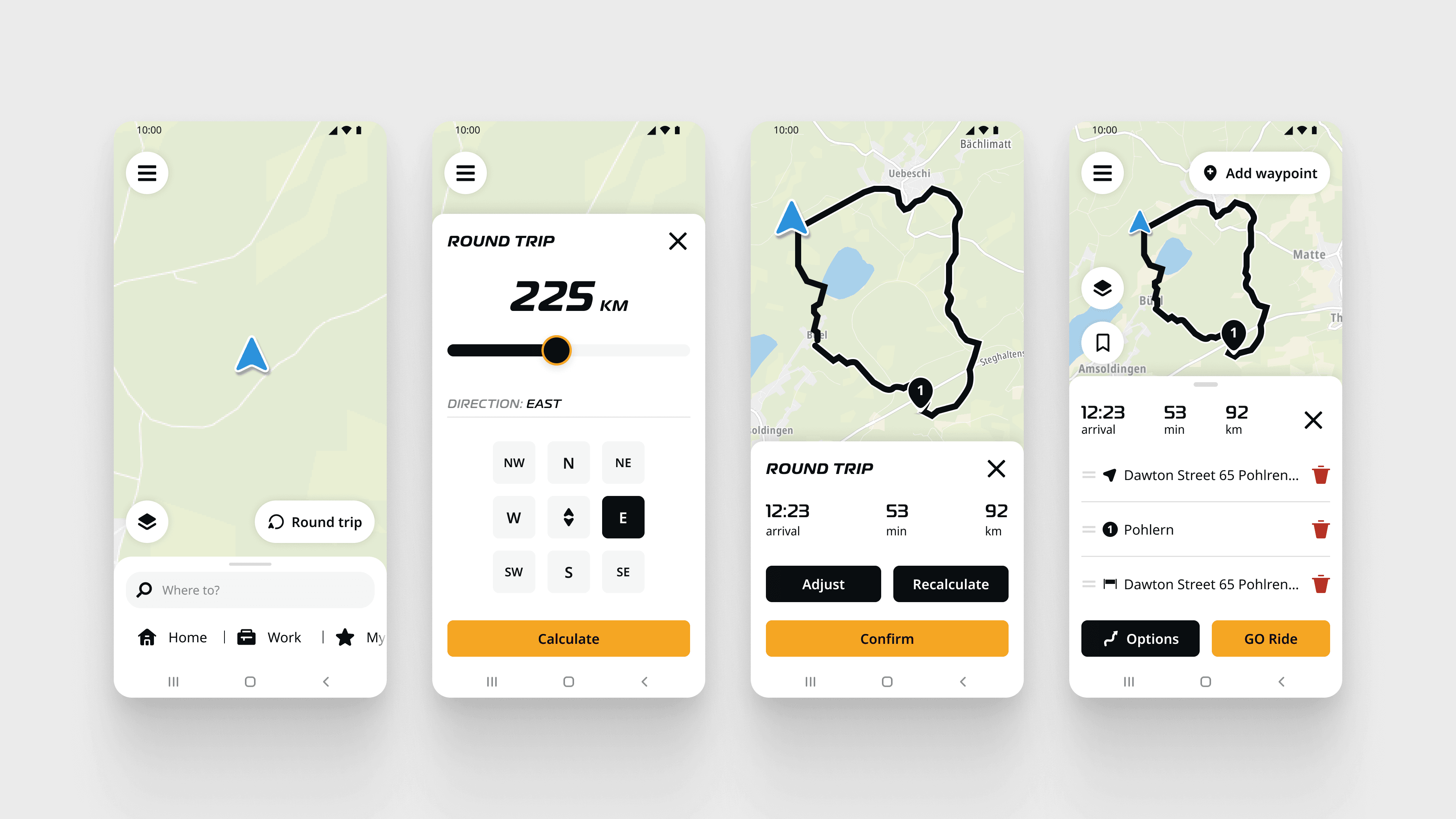
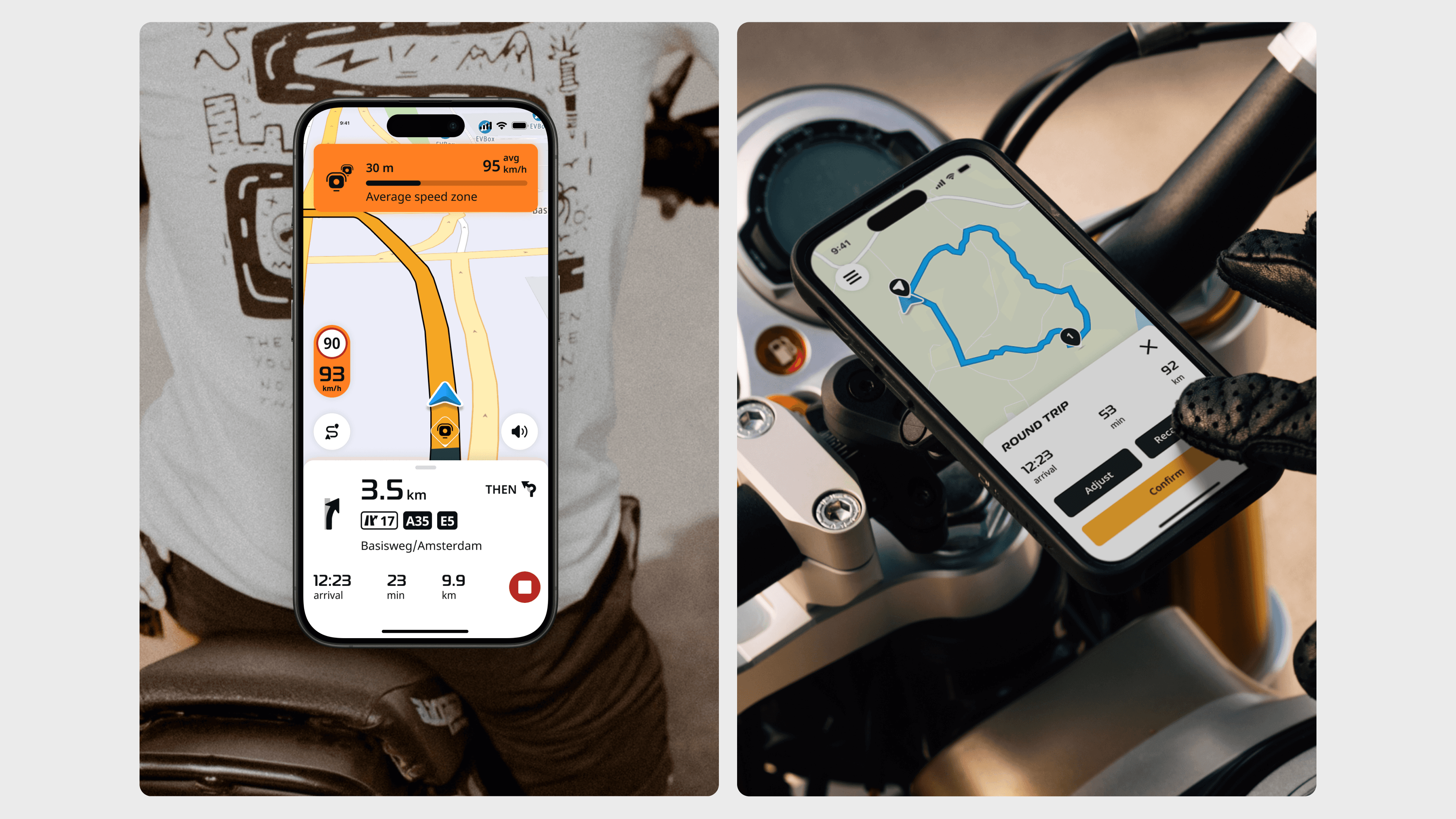
Round-trip planner
The round-trip planner became the most requested feature through user feedback channels and was considered essential before launching monetization.
Development was initially blocked due to reliance on an external API, which conflicted with TomTom’s internal tech strategy. To unblock this, I gathered benchmark data and user demand evidence, aligned stakeholders, and worked closely with engineers to repurpose an internal EV-range API to generate route coordinates—allowing the feature to ship without delays.
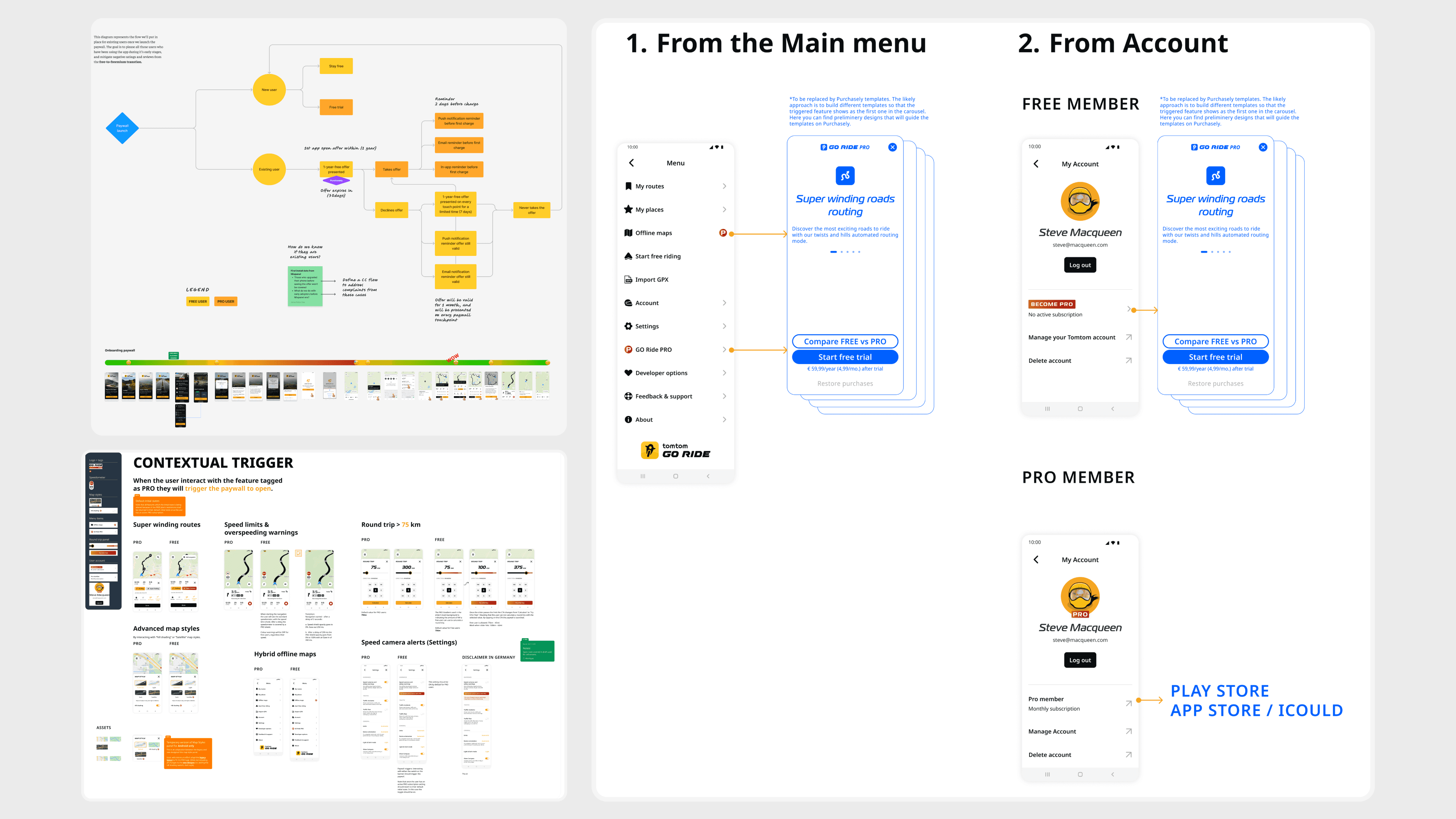
Phase 2 — Monetization and freemium strategy
Goal: Transition from free to paid without breaking user trust.
Moving to a freemium model required close alignment between UX, growth, and business goals. I collaborated with Growth and Product to:
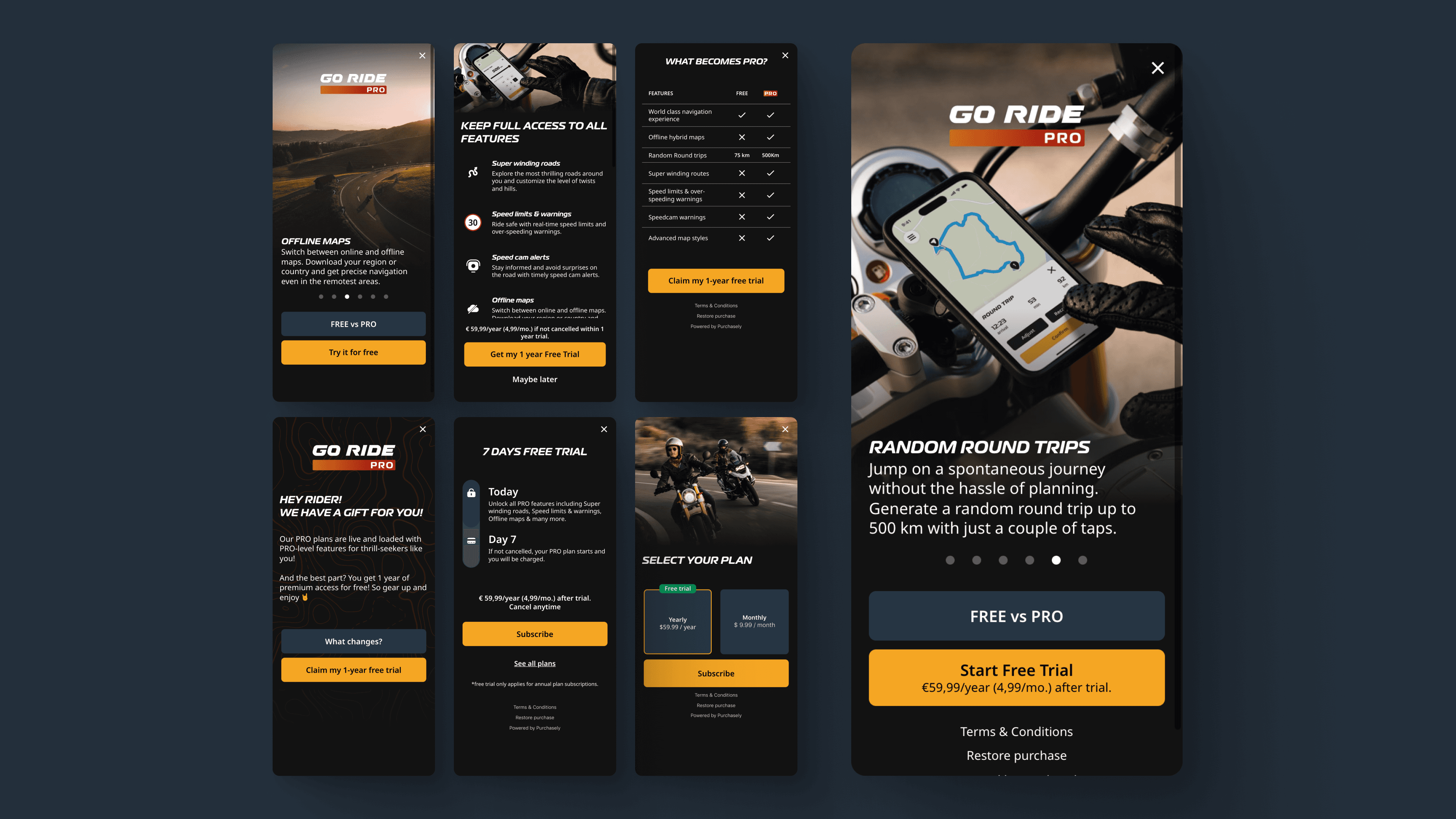
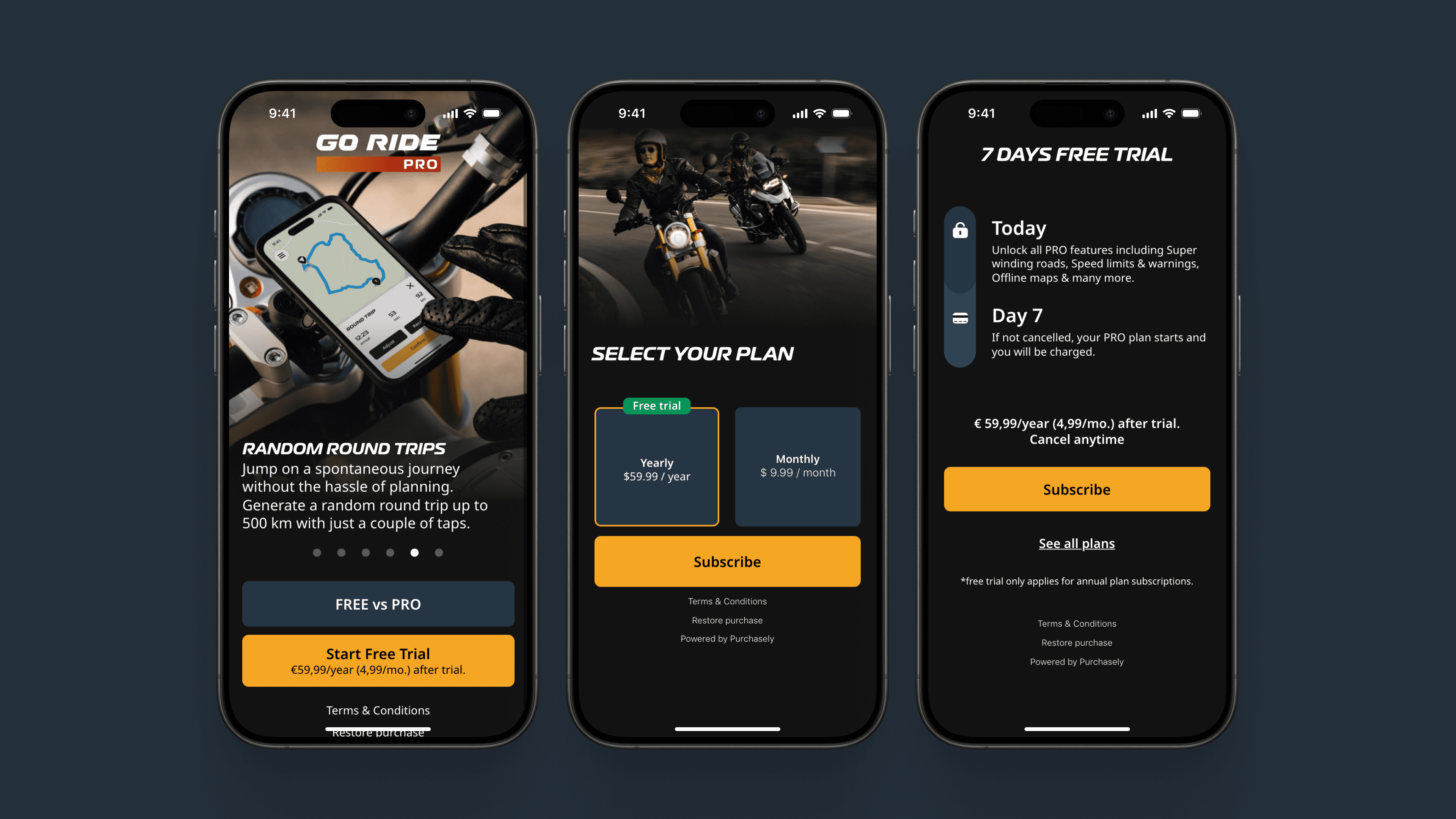
Define pricing tiers
Test value perception and conversion
Design paywall flows and PRO-tier visuals
Integrate a low-code third-party tool to enable rapid experimentation
At the same time, I planned and coordinated grandfathering communications to ensure existing users felt treated fairly during the transition—an important trust-building moment for the product.

Phase 3 — Testing, iteration, and scaling
Goal: Reduce onboarding friction and improve feature adoption.
Early user testing revealed friction during onboarding, leading to simplified flows and clearer guidance.
Paywall experiments helped refine both pricing and messaging, improving perceived value without overloading users.
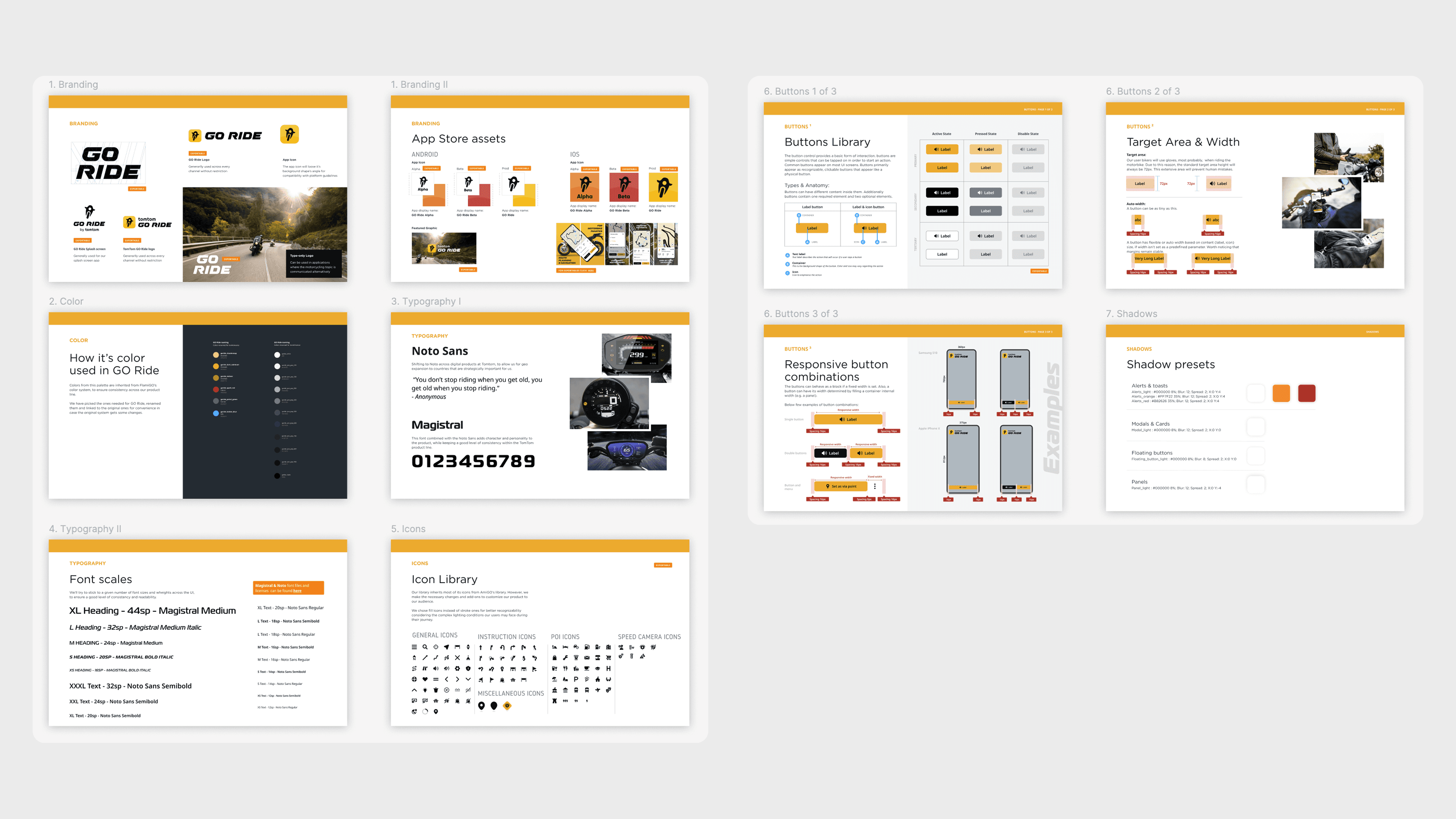
In parallel, I co-created and co-owned a lightweight design system:
Defined typography, color tokens, spacing, and iconography
Built responsive, cross-platform components for Android and iOS parity
Reduced feature delivery time and simplified long-term maintenance
Many of these patterns were later reused and expanded in TomTom’s flagship navigation app.
Impact
Round-trip planner became the most-used feature in the product’s history
15% reduction in onboarding drop-off
+35% onboarding completion
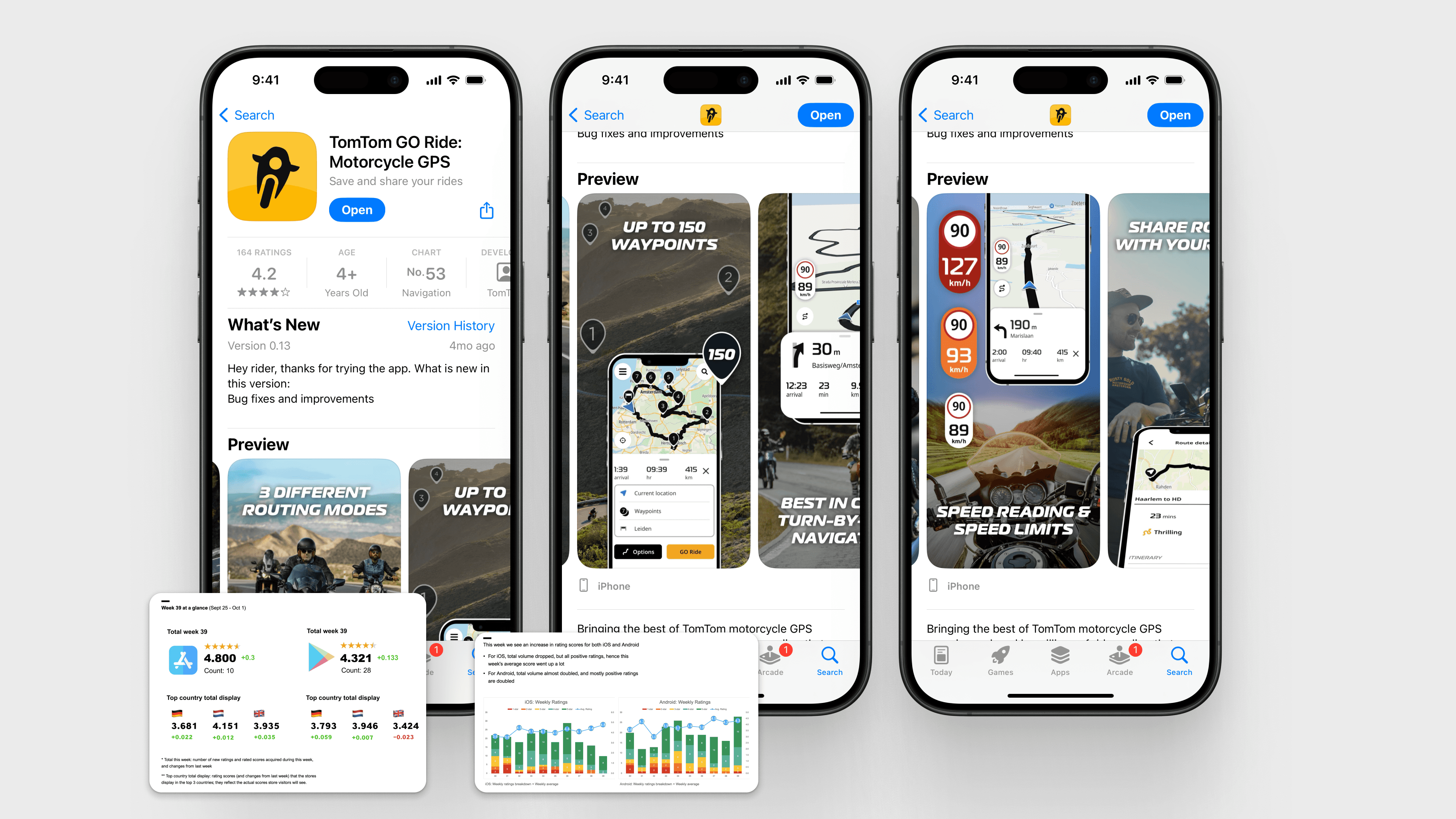
4.6 App Store rating
Enabled fast experimentation with pricing and conversion strategies
Design system patterns later adopted by TomTom’s flagship mobile app
Although GO Ride was eventually sunset due to a company-wide strategy shift, its design, system foundations, and technical solutions directly informed the next generation of TomTom mobile navigation.
Collaboration highlights
This project was highly cross-functional:
With PMs and Growth, I aligned rider value with monetization strategy
With engineers, I helped unblock feasibility issues and design within platform constraints
With researchers and marketing, I validated assumptions and refined messaging
With senior stakeholders, I communicated trade-offs between speed, scope, and long-term scalability
GO Ride shaped my approach to building focused products that balance user needs, business goals, and scalable systems—skills I later applied at a much larger scale on TomTom’s flagship app.