UI Leadership from Alpha to Launch
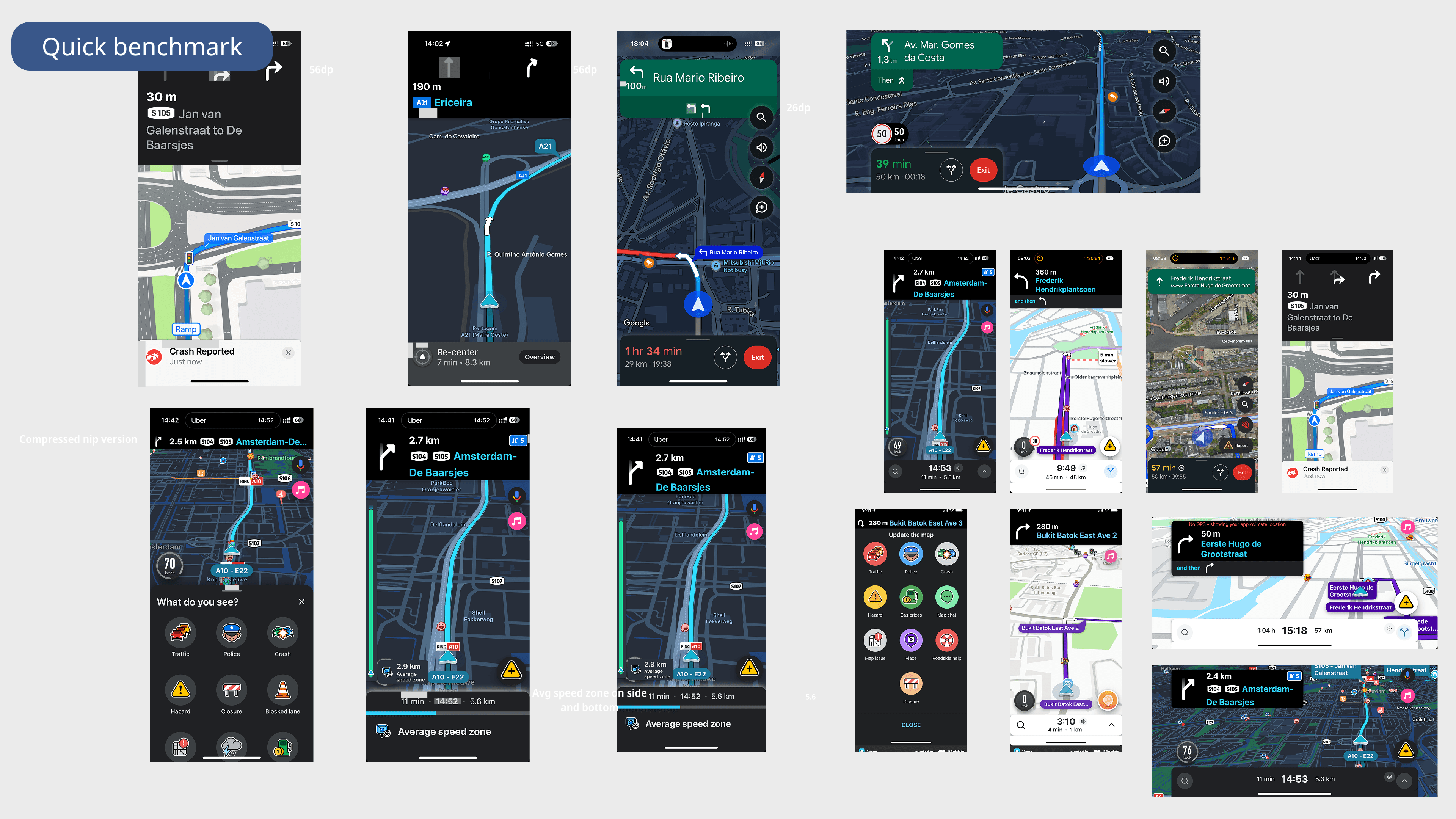
TomTom maps
I led the UI execution for TomTom’s new mobile navigation app, shaping a modern experience used by over 1M users. As a senior IC, I partnered with product and engineering to ship core navigation flows and user-driven improvements that supported 100% user growth during rollout.
Product Design
0 to 1
IOS & Android

Project Overview
Product: TomTom Mobile Navigation App
Company: TomTom
Platforms: iOS & Android; Carplay & Android Auto
Users: 1M+ active users
Timeline: 2 years
TomTom consolidated multiple consumer mobile apps into a single flagship navigation experience. The goal was to modernize the UI, migrate an existing user base, and establish a product led foundation that could scale across mobile and automotive products.
Outcomes at a Glance
500K → 1M active users within ~2 months of launch
2× faster design-to-development cycles via hi-fi-first specs
10+ features from concept to shipping
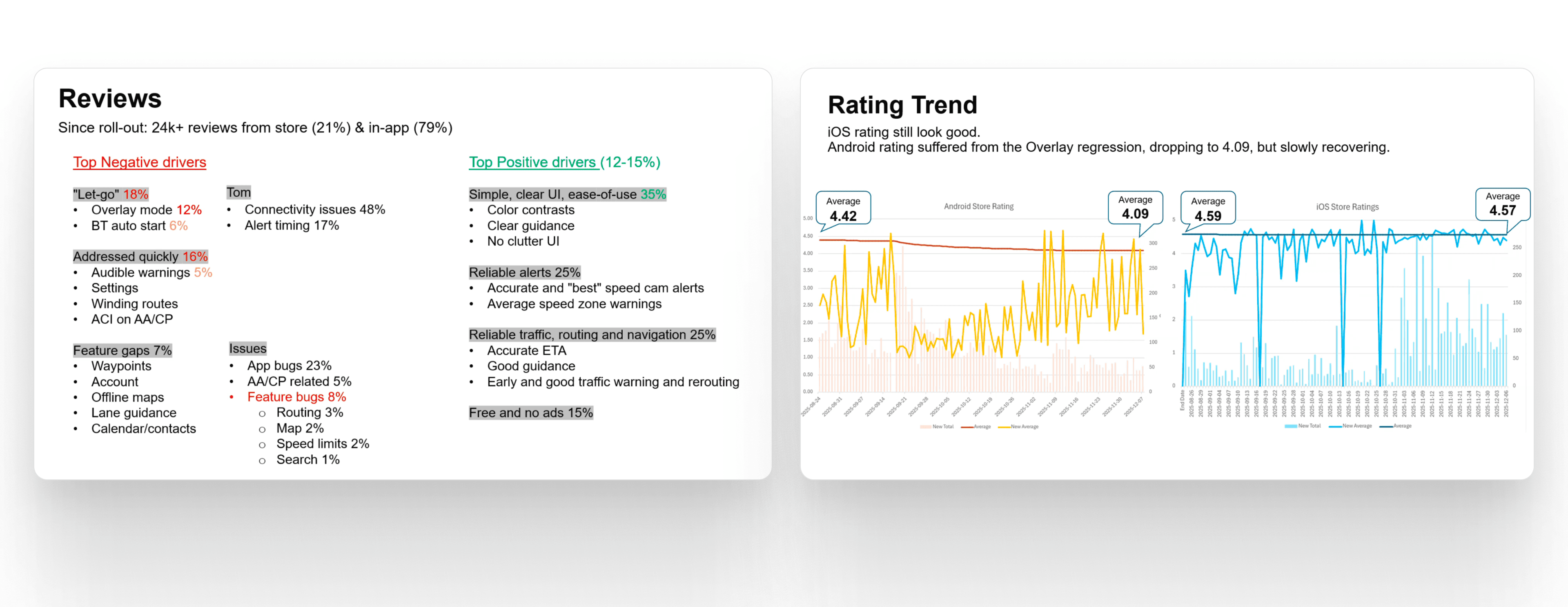
User-driven improvements & features shipped post-launch, easing transition backlash
80% of Amigo users retained (Goal of 90%)
Positive overall sentiment towards new UI
Context & Constraints
Tight timeline to deliver an internal alpha in ~6 months
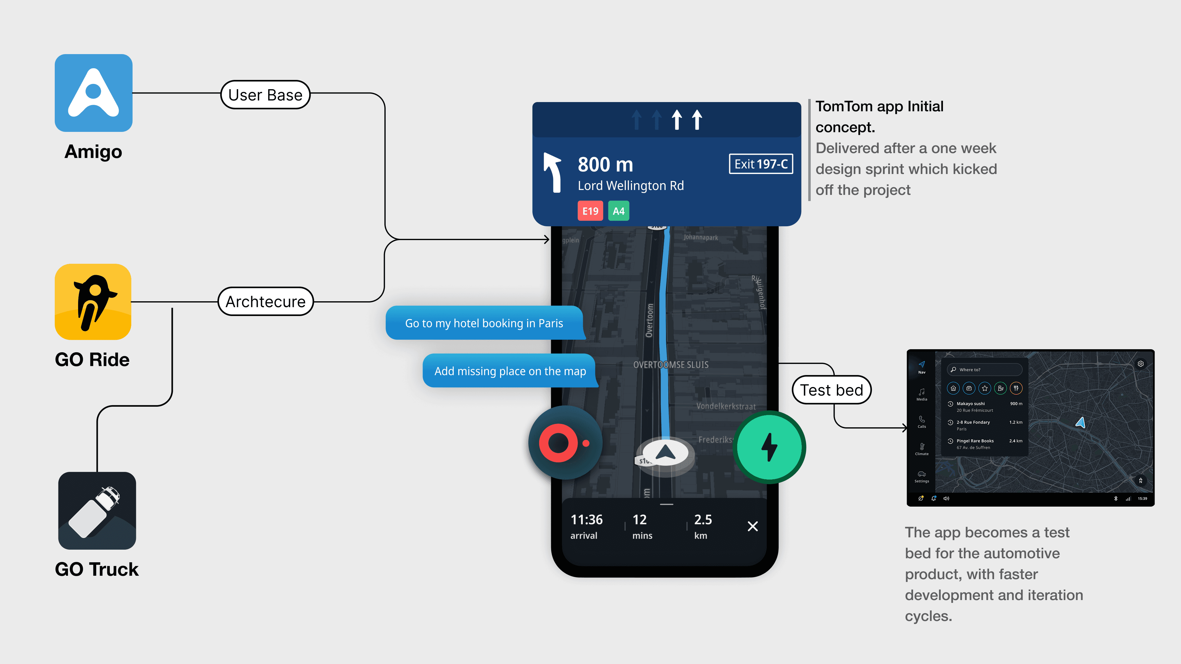
Existing codebase inherited from a previous app (GO Ride)
Strong legacy automotive design influence within the organization
Early focus on shipping functionality over visual refinement
This meant early UI decisions had to prioritize feasibility and speed, while keeping a clear path for later modernization.
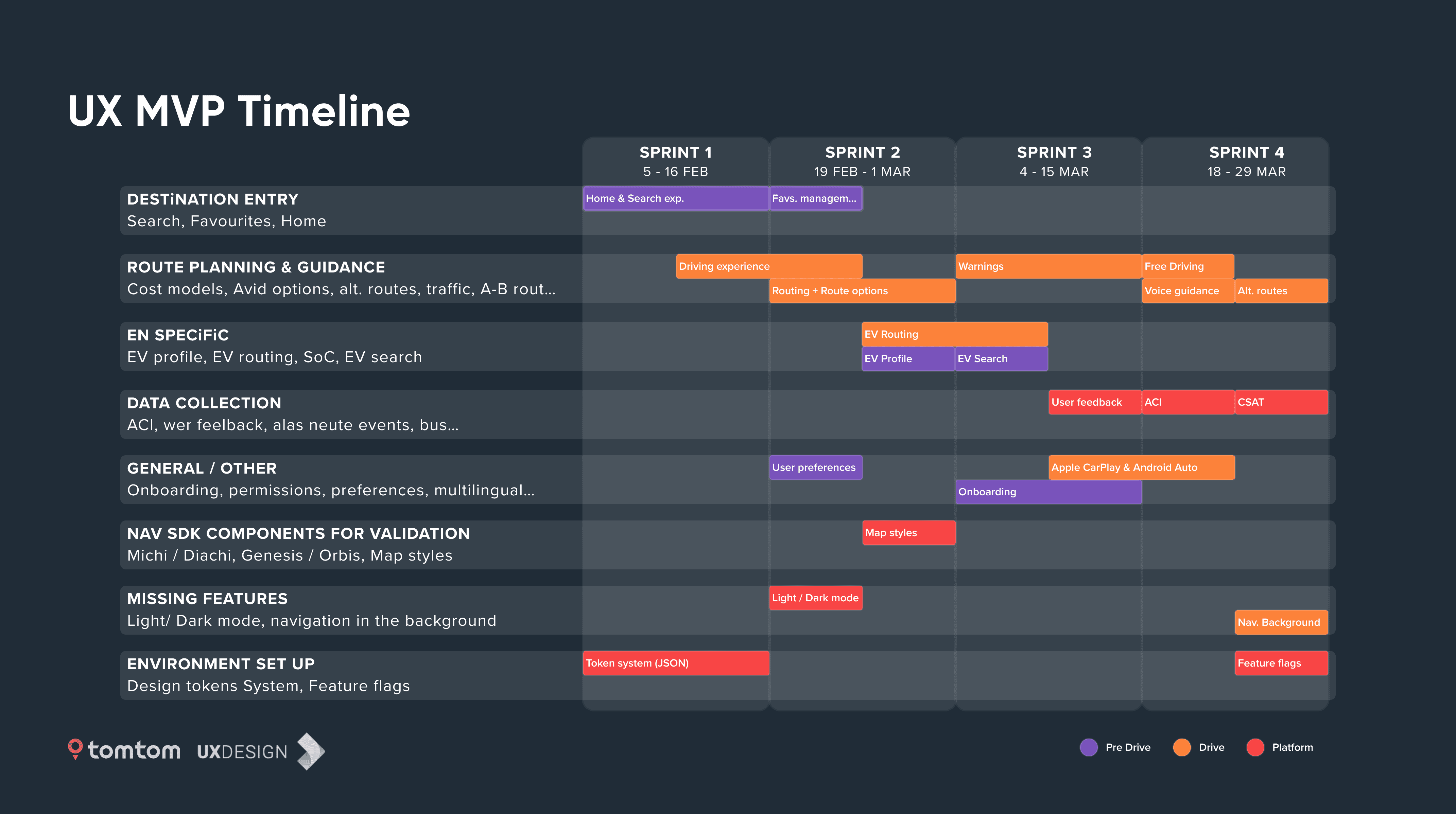
Phase 1 – Shipping a Coherent UI Under Deadline Pressure
Goal: Enable a fast internal alpha without sacrificing long-term UI coherence.
What I Did
Designed UI solutions aligned with what engineering could realistically ship under time and technical constraints. Design decisions balanced the architecture coming from GO Ride, designs from Automotive and feature parity with Amigo
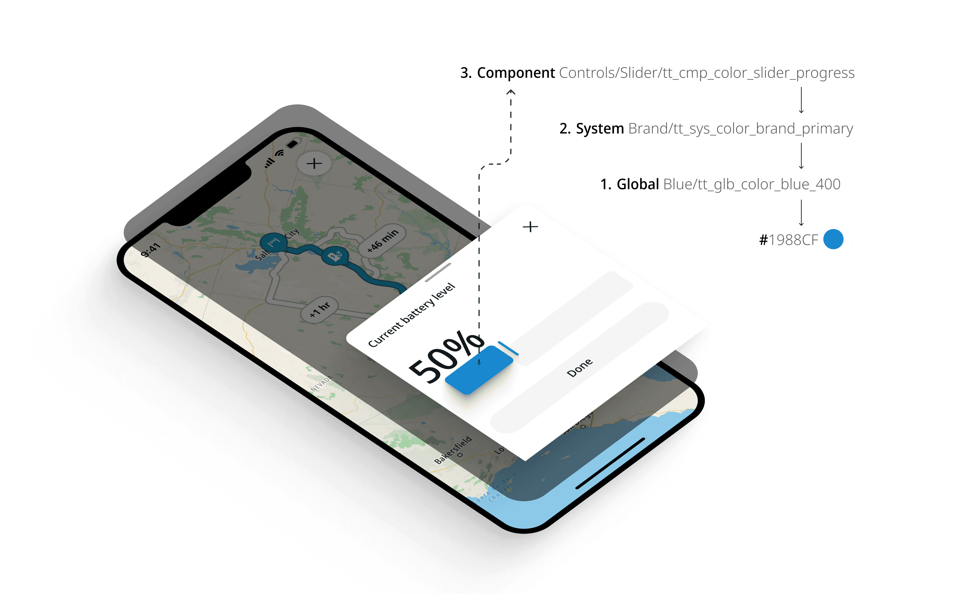
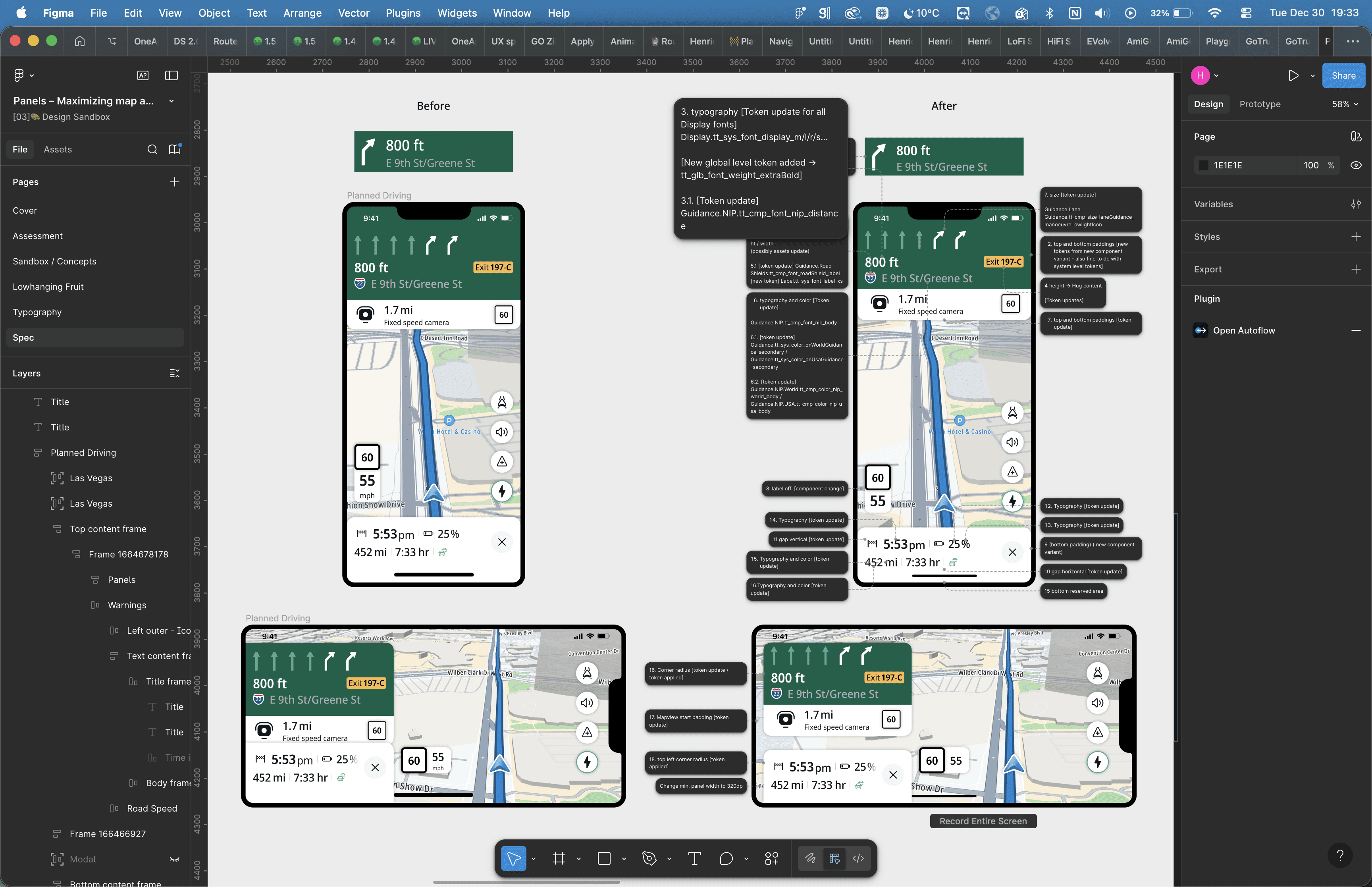
Maintained visual consistency across screens despite limited component maturity via a more flexible design system architecture with a component specific third level of abstraction in the token structure
Why it mattered:
This phase established trust with engineering and allowed the team to hit critical milestones without creating unmanageable UI debt.
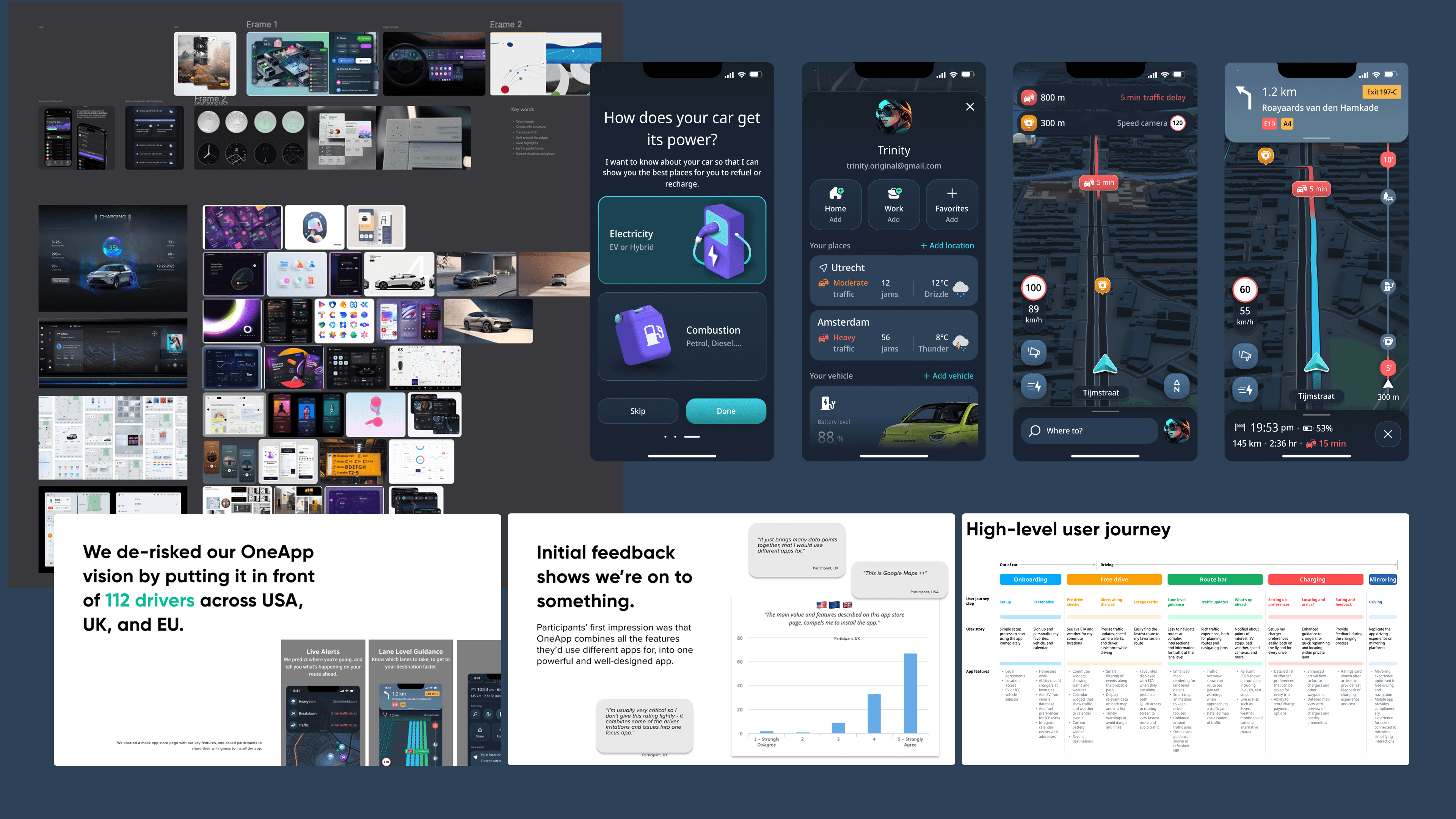
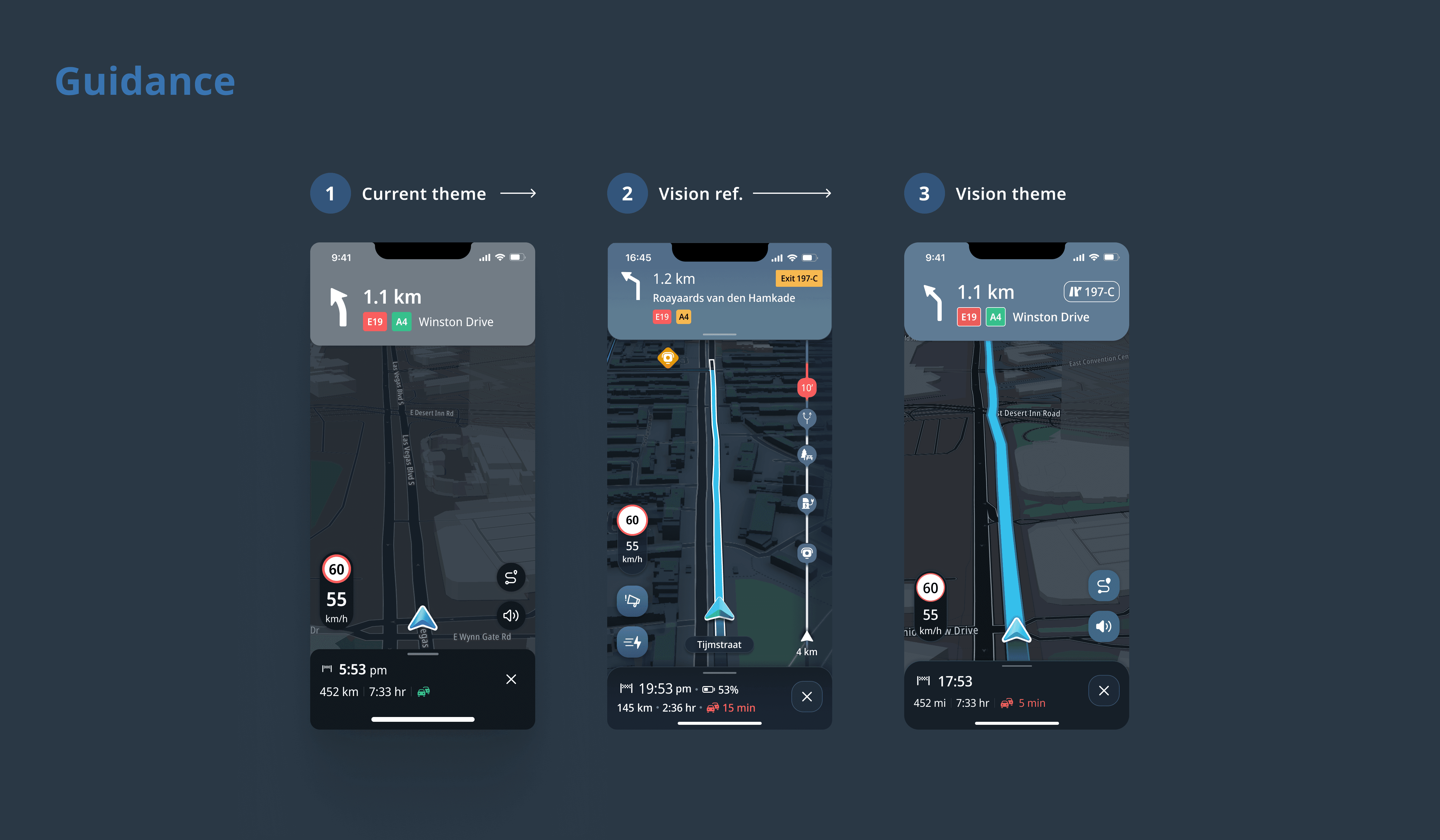
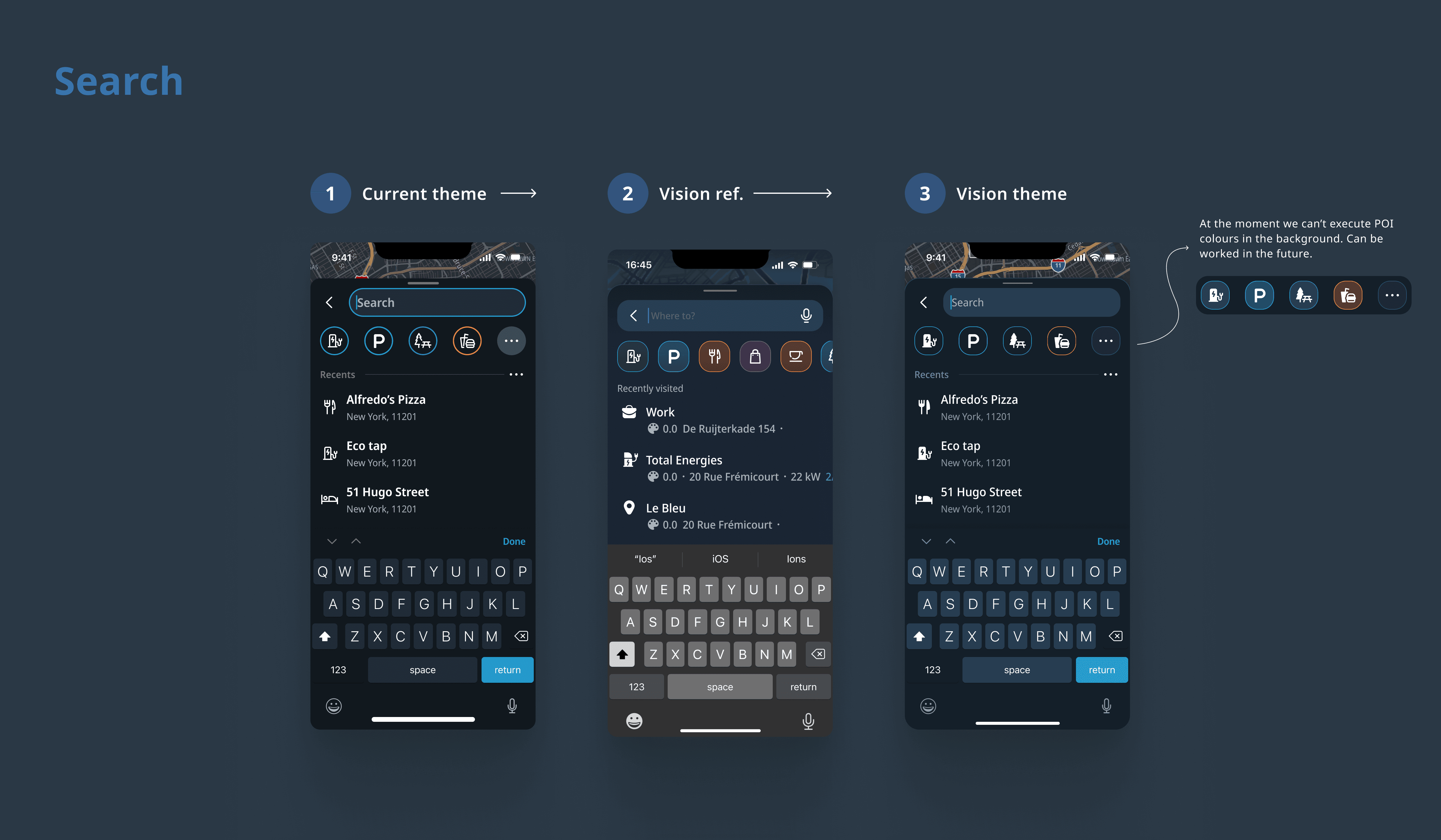
Phase 2 — Reclaiming and Modernizing the Visual Direction
Goal: Move beyond “just shippable” UI toward a modern, mobile-first TomTom experience.
What I Did
Partnered with product leadership to create space for visual refinement post-alpha
Collaborated with senior automotive designers to align on a shared visual direction
Translated high-level visual vision into concrete UI explorations and component-level specs
Although organizational changes prevented the full theme from shipping at once, this work directly influenced later UI decisions and system evolution.
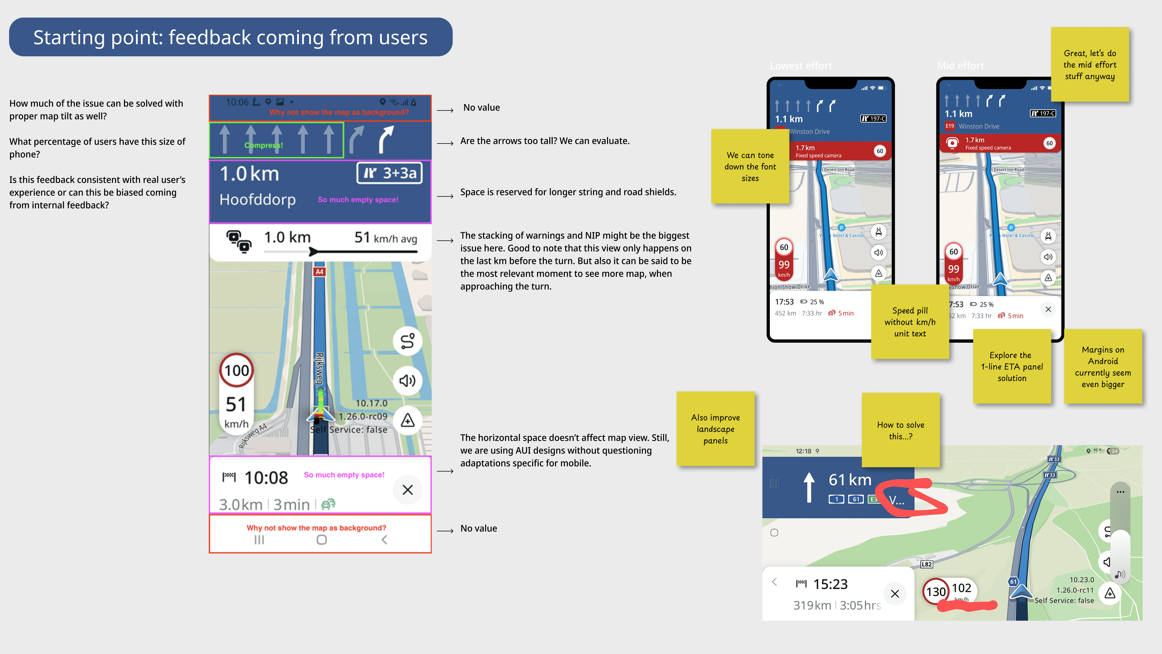
Phase 3 — Shipping UI Improvements Driven by Real User Feedback
Goal: Restore user trust and improve usability after public launch.
After launch, the app saw significant backlash due to missing parity and usability gaps.
What I Did
Partnered with PMs to triage user reviews and support tickets
Identified UI-related pain points that could be addressed quickly
Delivered clear UI specs and worked closely with engineers to ship fixes fast
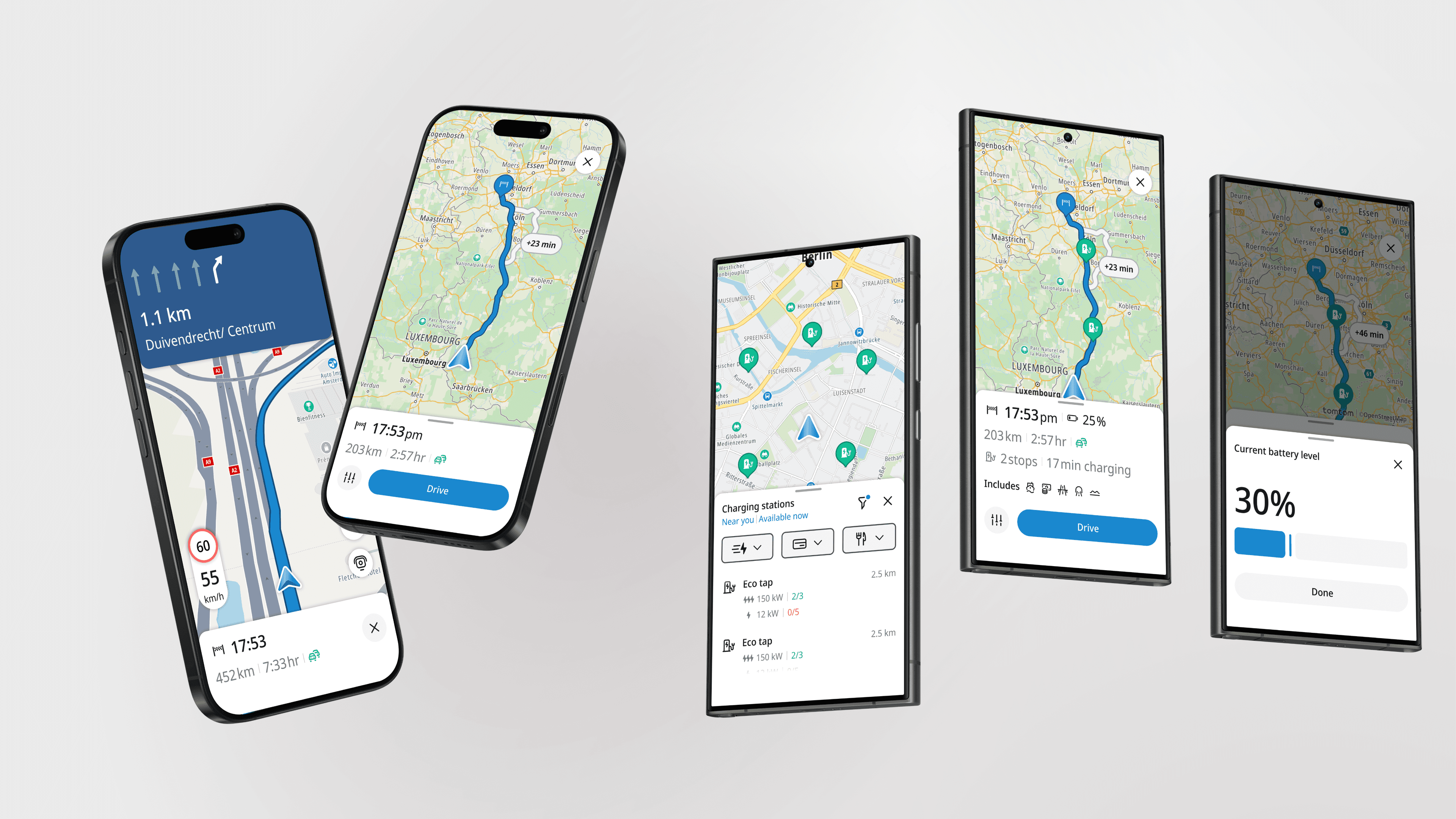
Examples of Shipped Improvements
Navigation warnings and visual clarity
Settings granularity and discoverability
Feature-level improvements such as Winding Routes
Panel token optimization to expose for map area
Using AI to accelerate craft and iteration
AI became a practical tool in my day-to-day workflow, helping me move faster without compromising quality or consistency.
Micro-animations and interaction detail
I used Figma Make, connected to our design system, to specify micro-animations on small-scale components. This allowed me to explore and document interaction details that would have been very time-consuming with conventional tools, while keeping everything aligned with existing tokens and components.
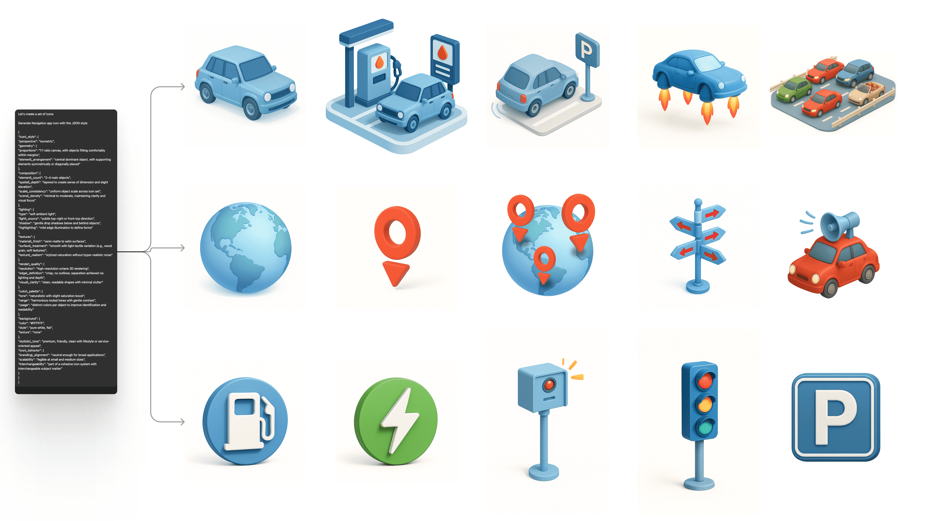
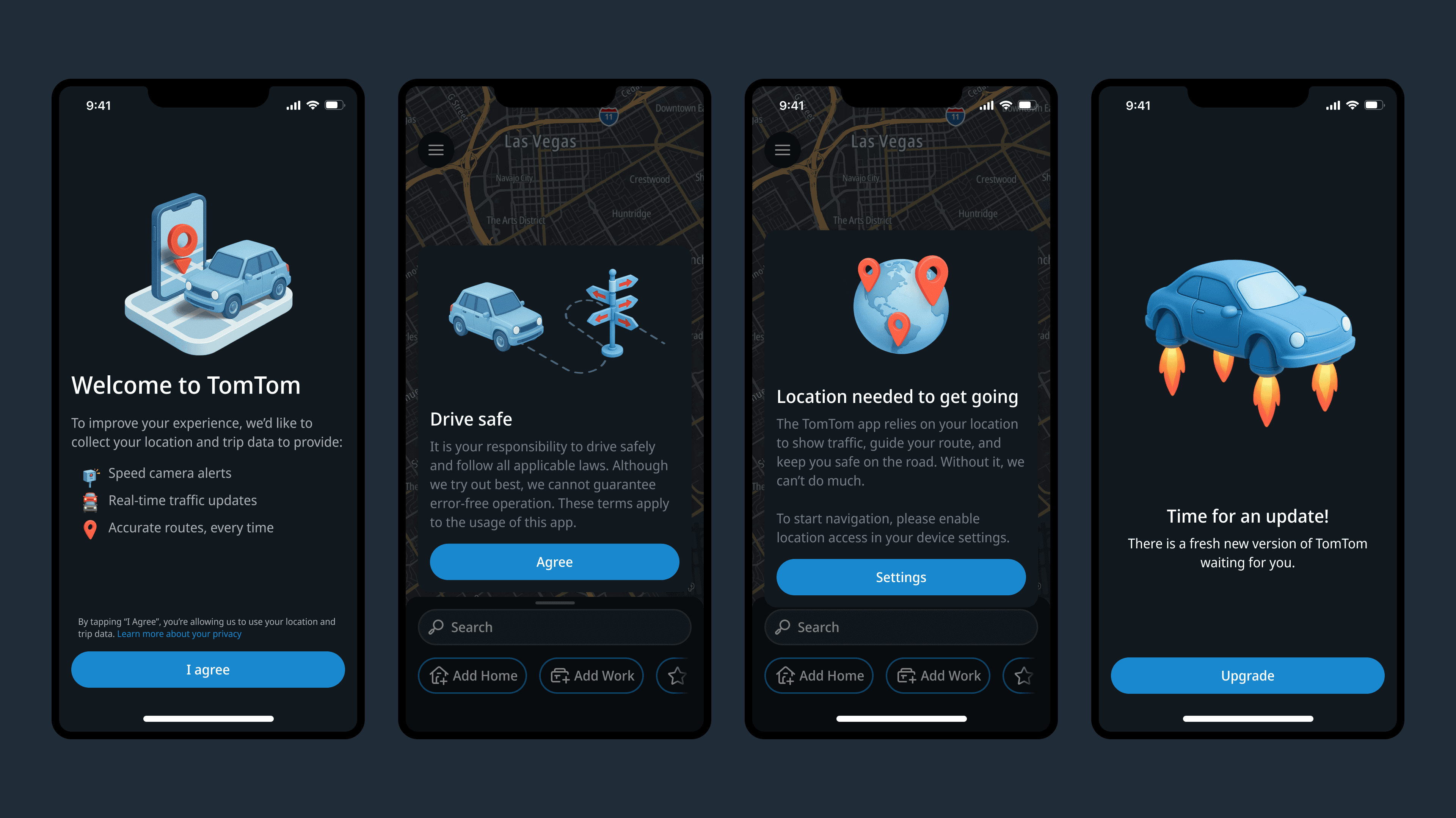
Illustration set
I used ChatGPT and later Nano Banana to produce a consistent illustration set for the app. Consistency was achieved through a JSON-based style prompt, which allowed me to tweak specific attributes (such as tone, shapes, or color emphasis) while preserving a cohesive visual language across all illustrations. This approach, although still limited as AI image creation keeps on evolving, showed consistent enough to deliver all illustrations needed across the app experience on launch and initial growth phase.
Impact
Active user base doubled shortly after launch
User feedback highlighted improved clarity and visual quality
UI improvements helped stabilize the experience after early backlash
This phase demonstrated my ability to own UI quality end-to-end, from concept through shipped code and real-world feedback.
It looks great. I loved the new version, congratulations on the app.
Key Takeaway
I operated as a senior IC focused on shipping high-quality UI at scale, balancing delivery pressure with long-term visual integrity, and driving measurable improvements after launch through close collaboration with product and engineering.