Search Flow & interaction redesign
TomTom maps
I contributing to the full UX, while owning the navigation interaction redesign and the UI design for TomTom Maps' search flow across its lifecycle -- from the initial experience under tight constraints, through the navigation architecture overhaul after alpha, to evolving the flow through filters, richer POI data, and conversational AI search.
UX & UI
IOS & Android
Project overview
Product: TomTom Mobile Navigation App
Company: TomTom
Platforms: iOS & Android; Carplay & Android Auto
My Role: Interaction Design, UI Design
Team: Maryna Akolzina IXD, Kareem Elkady IXD, Tim Standring DS.
Timeline: 2 sprints first iteration, 3 sprint navigation redesign
Context
TomTom Maps launched with two goals: be a showcase for TomTom's core technology, and reach millions of users. Search was central to both being a direct expression of the technology and the entry point to every journey.
Constraints
The constraints were clear: tight timeline, inherited architecture, and interaction patterns being reconciled from three different products at once.
We had to deliver speed for the business and reliability for the user.
Problem
Scenario
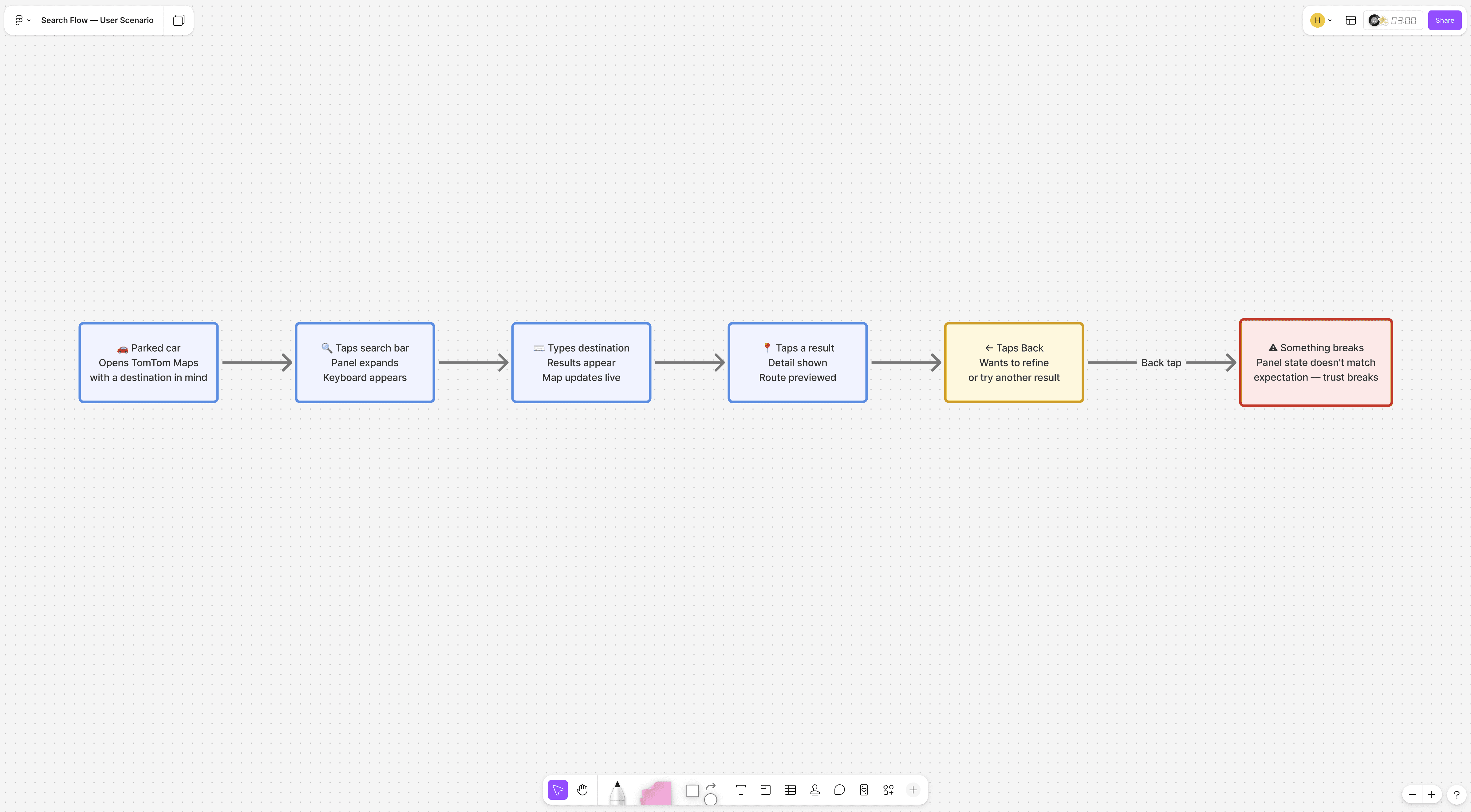
Finding a place and getting there reliably is the core promise of any navigation app. A user sitting in a parked car opens TomTom Maps and searches for a destination. They type, see results, tap one to preview, then want to go back and refine the query. They tap back. Something unexpected happens. User is frustrated, kills TomTom Maps and opens their old navigation app.
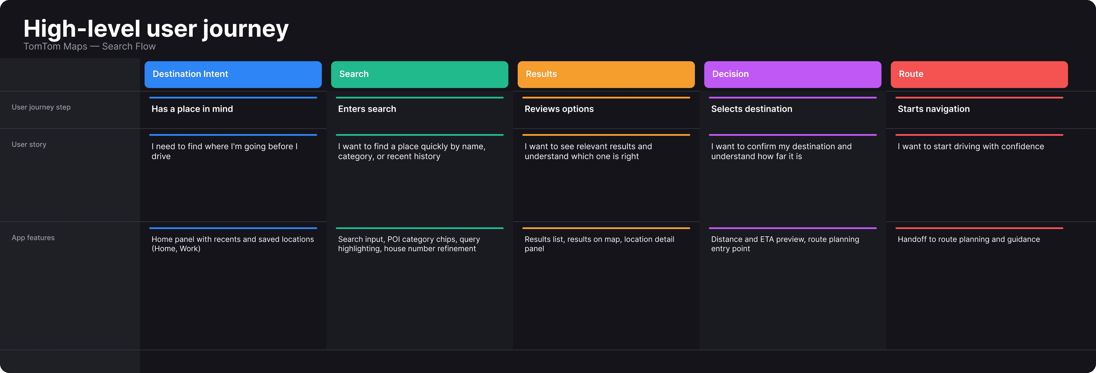
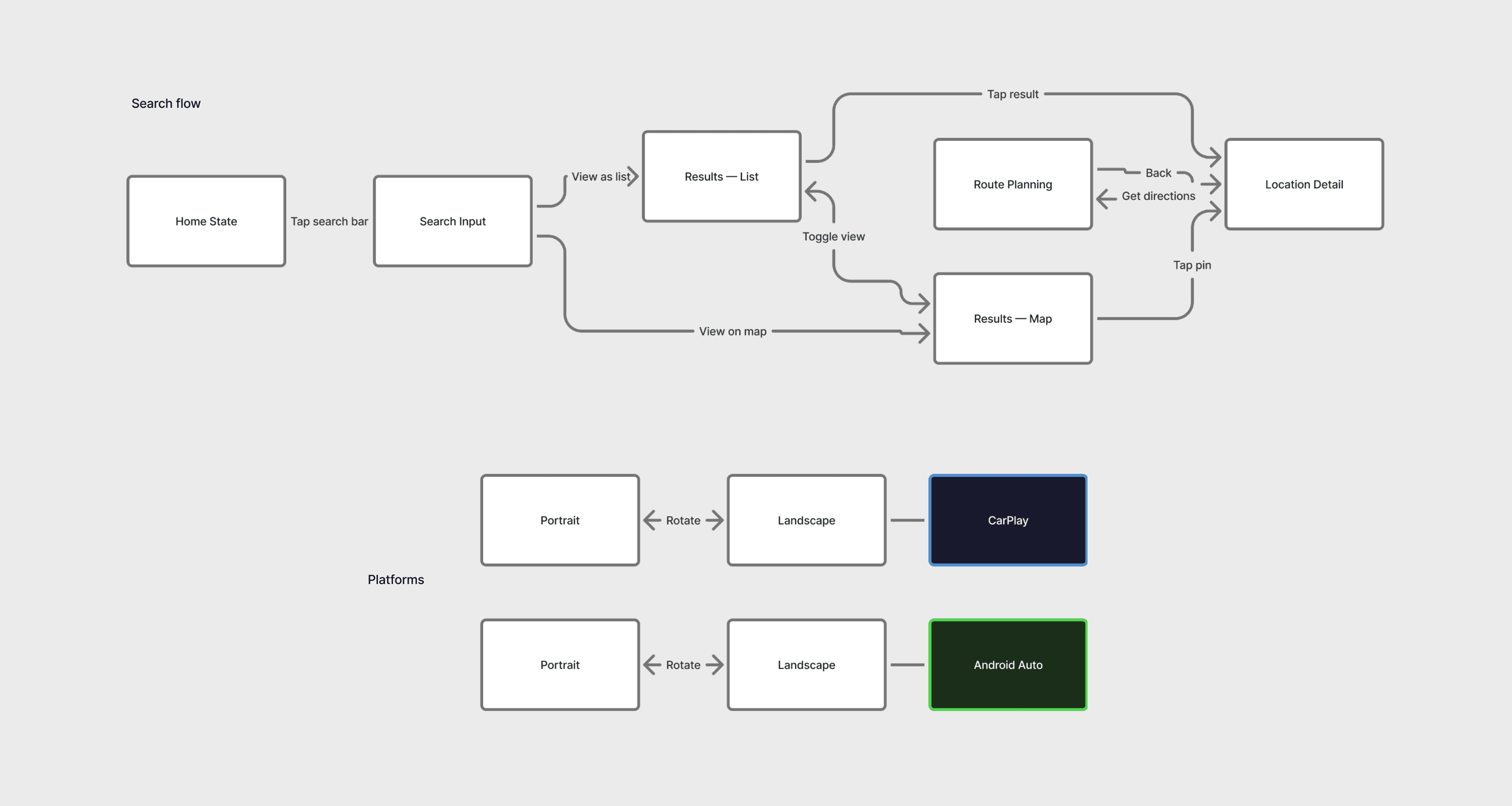
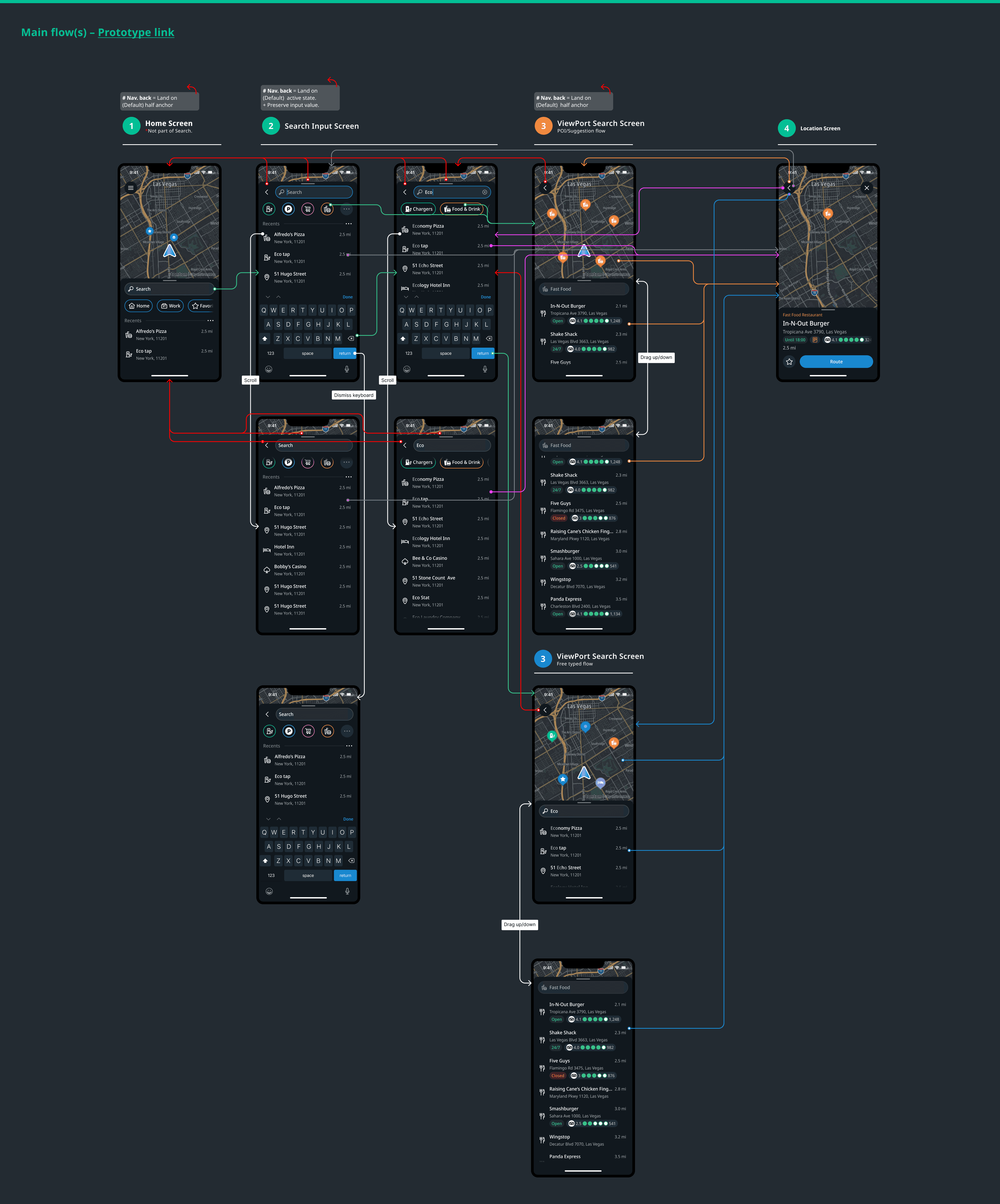
The search flow
Process
Initial design approach
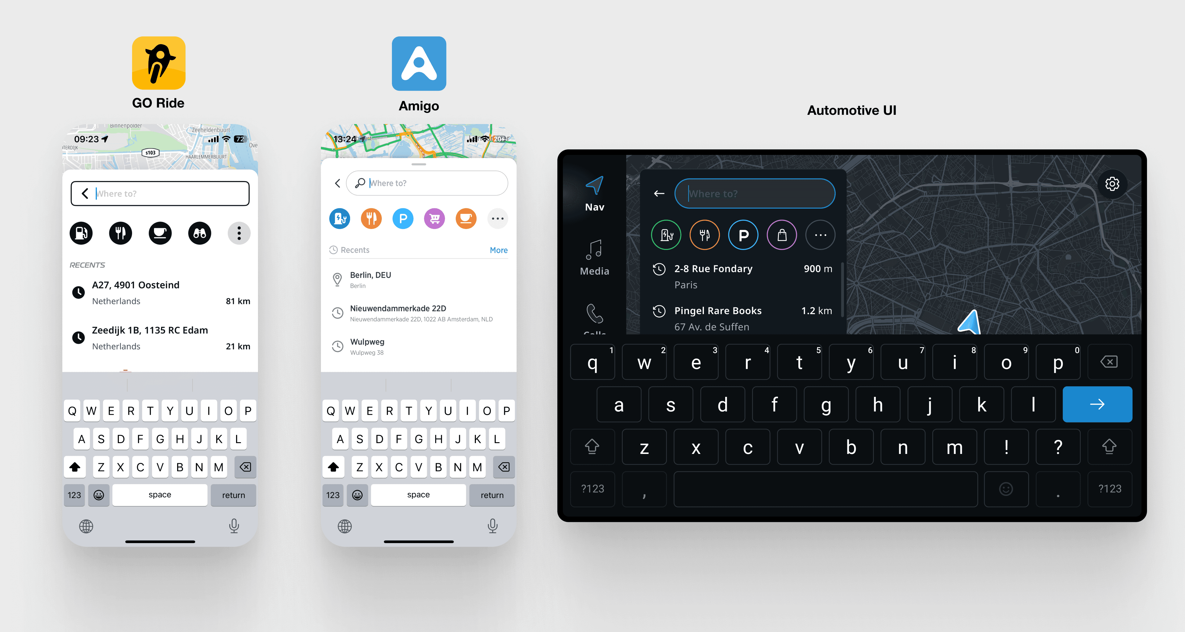
The foundation was GO Ride's architecture, Amigo's mobile flow, Automotive UI's component patterns, and TomTom's search API.
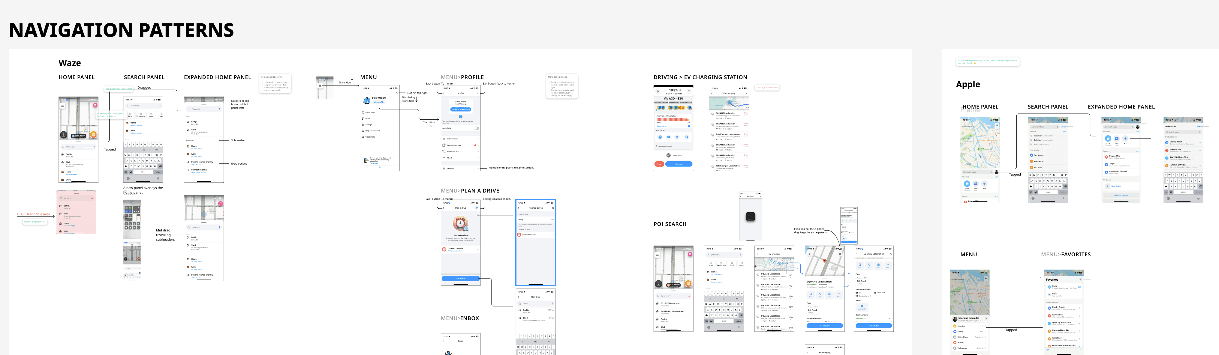
UX Audit and Benchmark
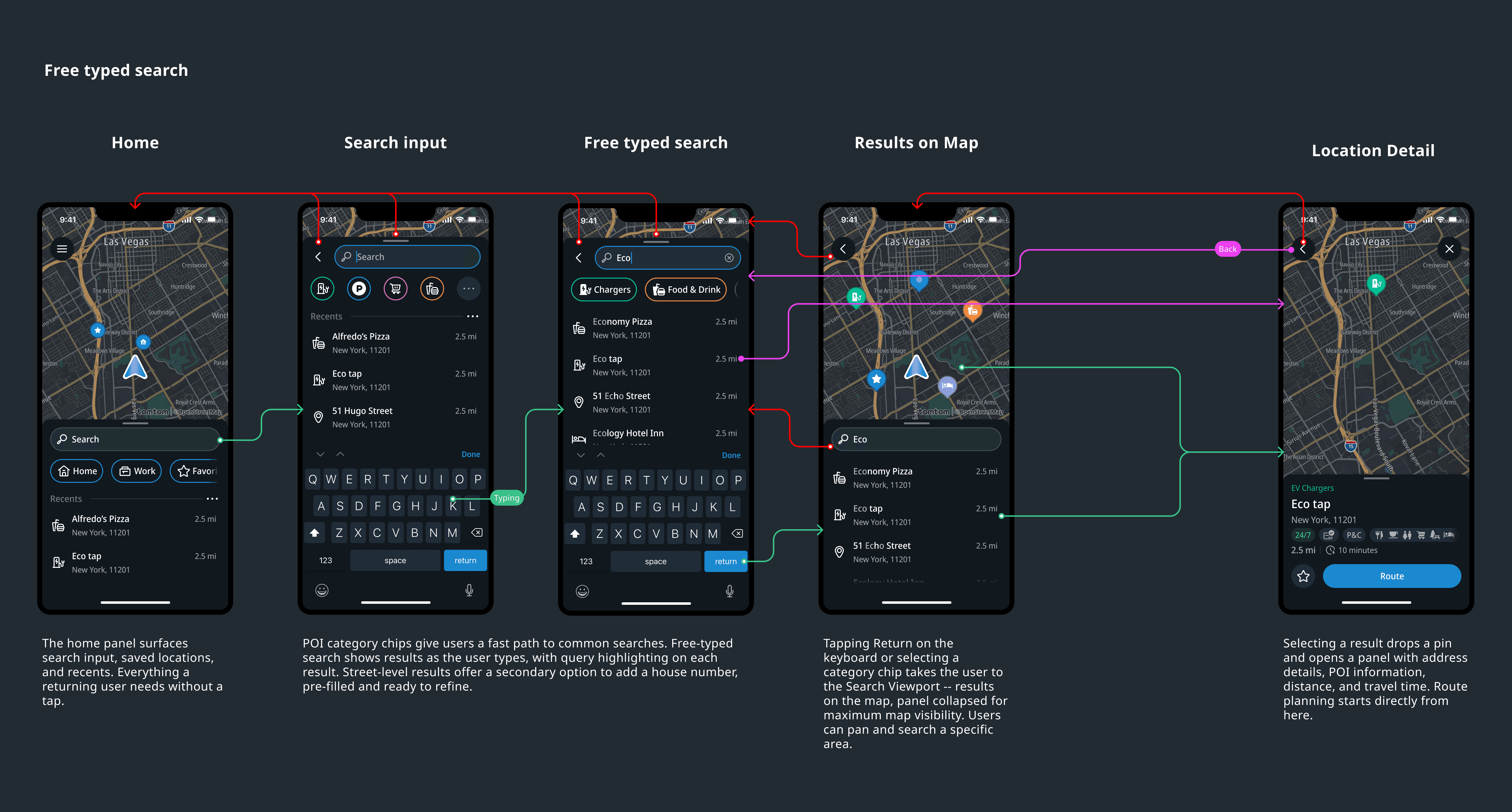
Before execution, the team audited existing TomTom products and I ran a competitive analysis across Waze, Apple Maps, Google Maps and some other more niche competitors -- mapping how each handled the relationship between search input, results list, and map view.
Given the timeline, there was no room for extended exploration. Take what was known, adapt to mobile-first, ship. The right call for the constraints. It also set up what surfaced in alpha.

Alpha feedback and what it led to
Signal
Users flagged search as unpredictable. The back button wasn't behaving as expected.
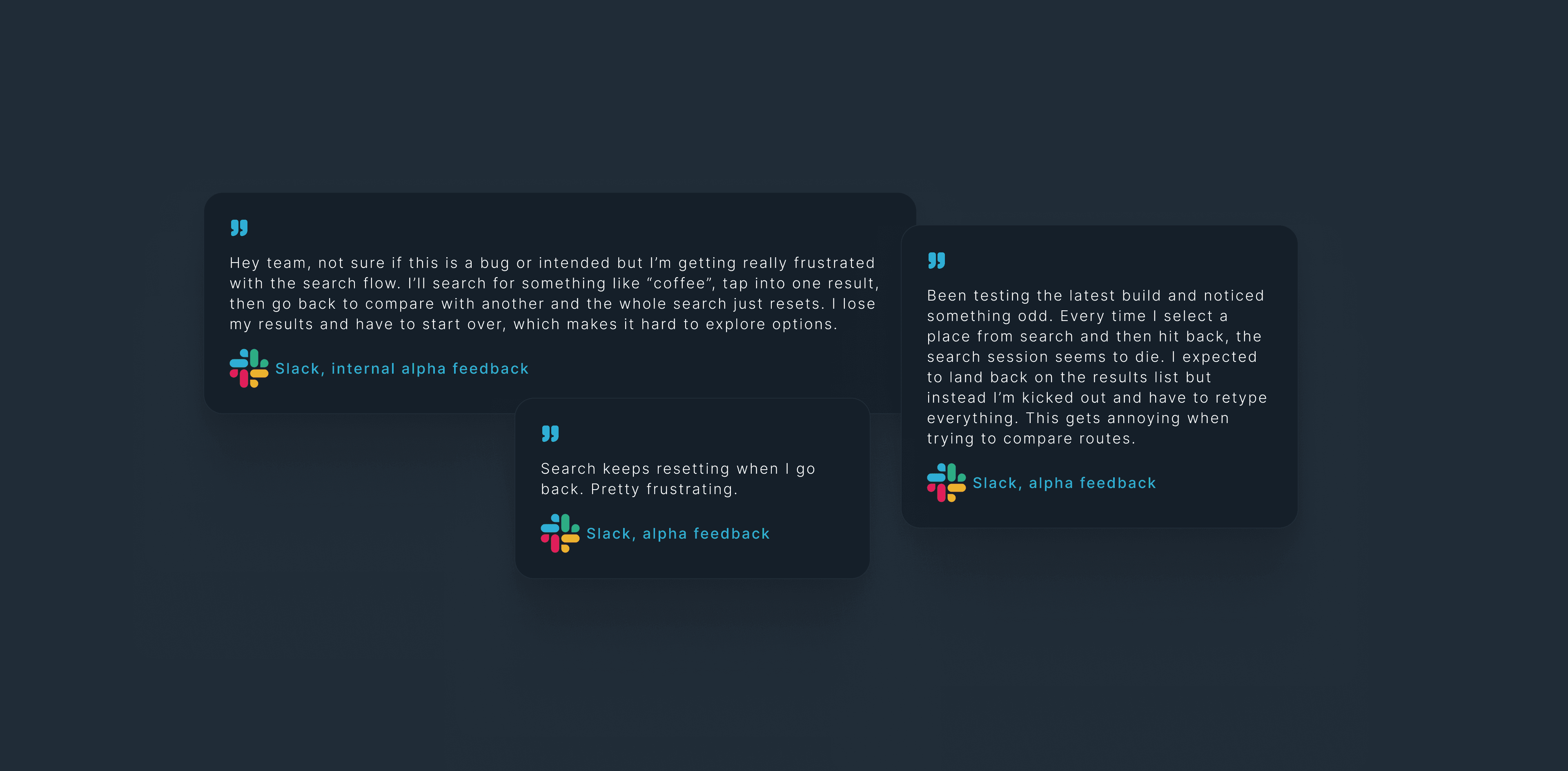
Our initial specifications only considered the happy paths and were too linear, even tough we already covered empty states and error handling, we did not stress tested the possible navigation interaction edge cases.
Diagnosis
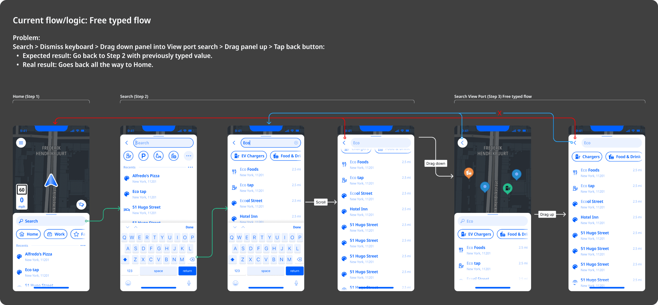
At first I treated it as a bug, got engineering to fix it, and it broke something else downstream. That was the signal: if fixing one instance breaks another, the problem isn't the implementation, it's the model underneath.
Defining the journey steps
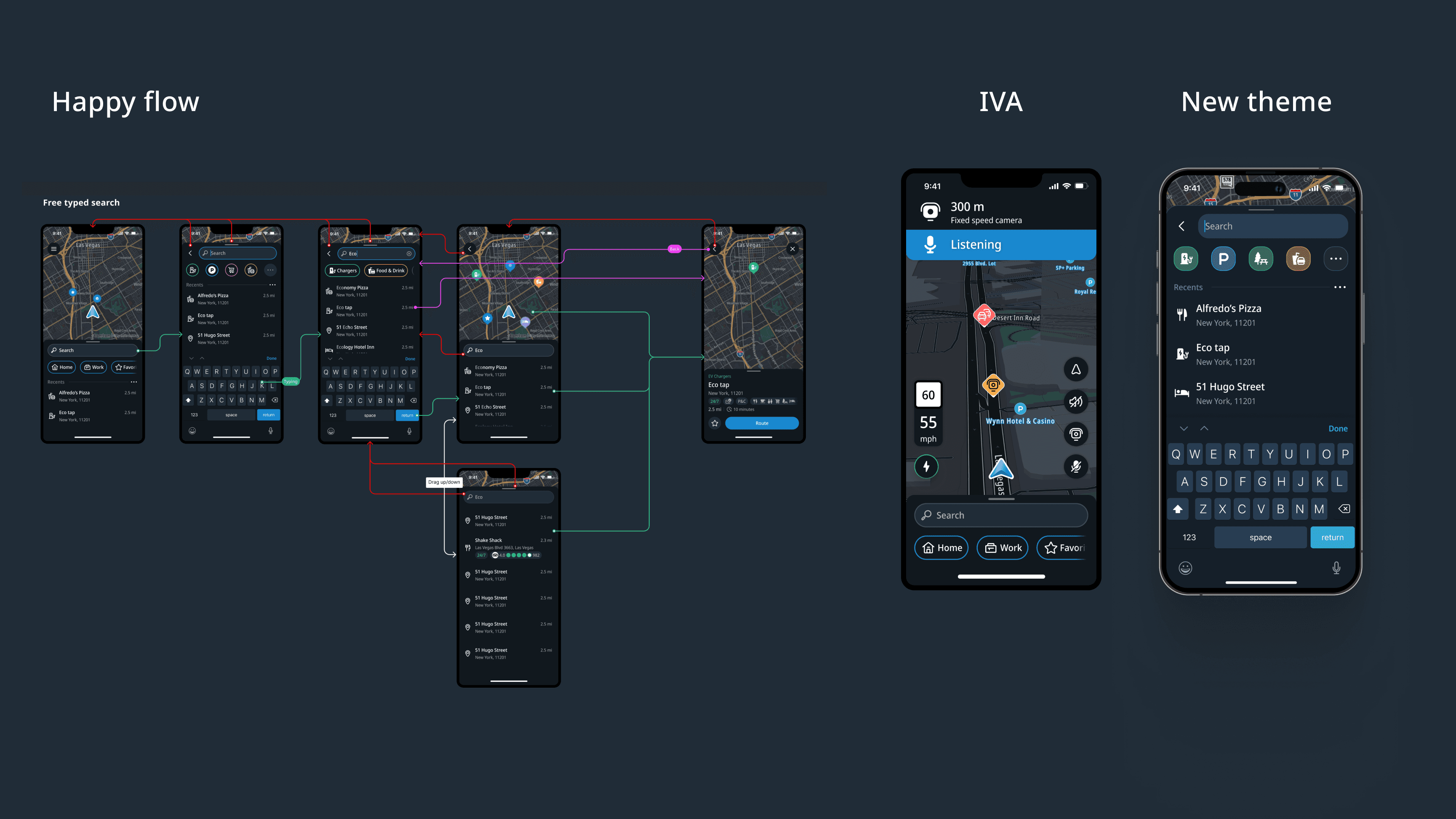
A clear analysis of the journey the user took, step-by-step, was essential to identify the root cause. When placing all screens in a linear step by step flow, considering all possible states of each flow we can clearly see that the same exact UI shows in two separate steps. And that is what seems to be causing the navigation issue. As the screens were the same, engineering treated the as the same. Therefore, if you fixed the back button behaviour for one of them, the other would break.
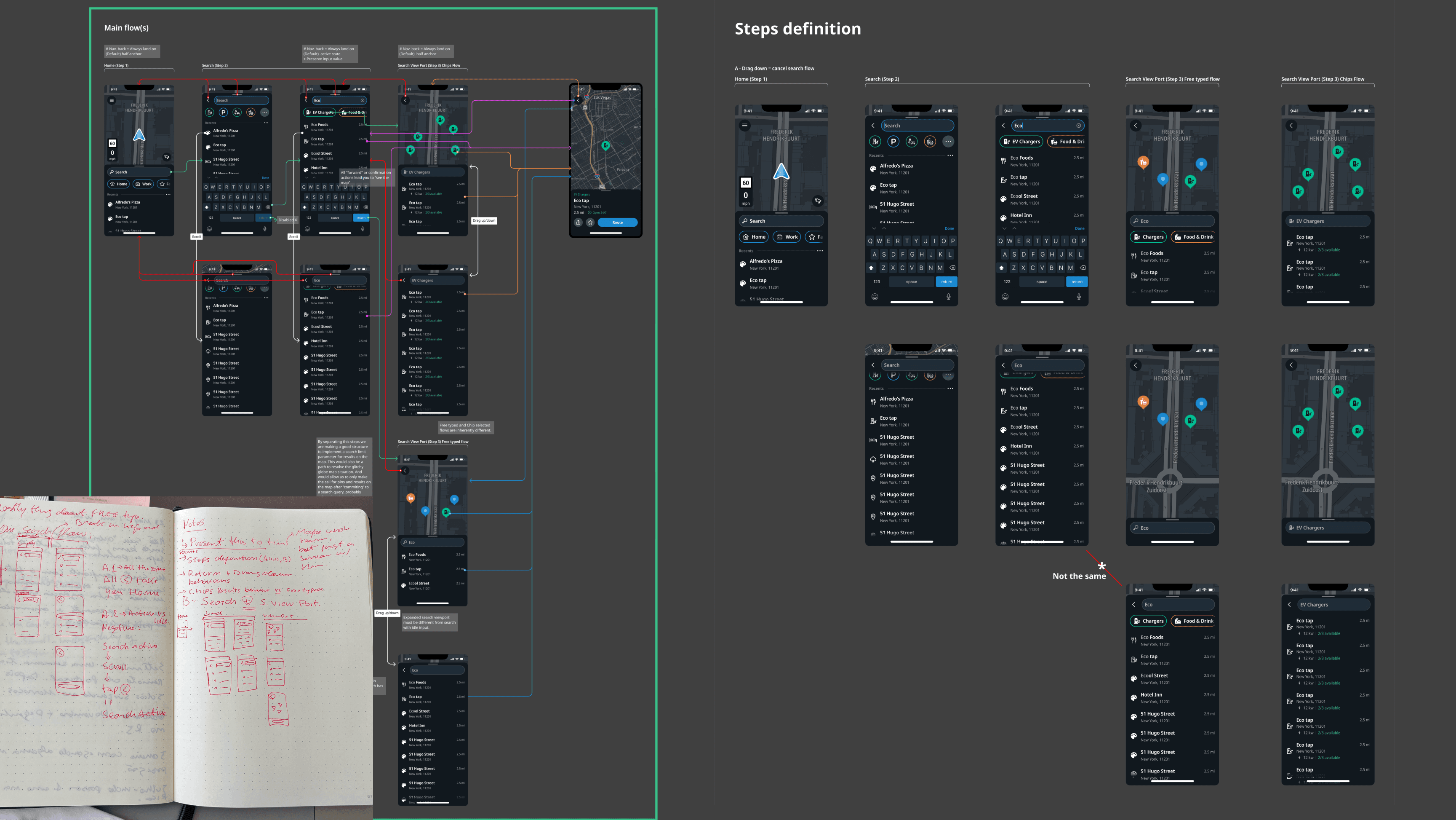
Three concepts explored.
I explored different ways to solve this issue in the flow with developers, coming up with three concepts.
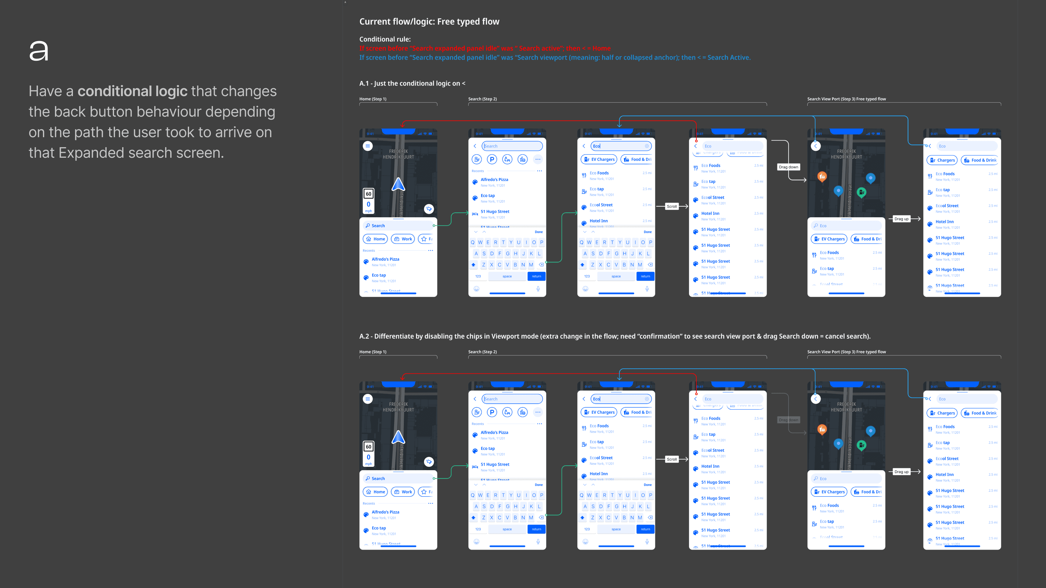
a) Conditional logic. Change back button behaviour based on the path taken. Fragile -- conditional rules compound with every new flow variation.
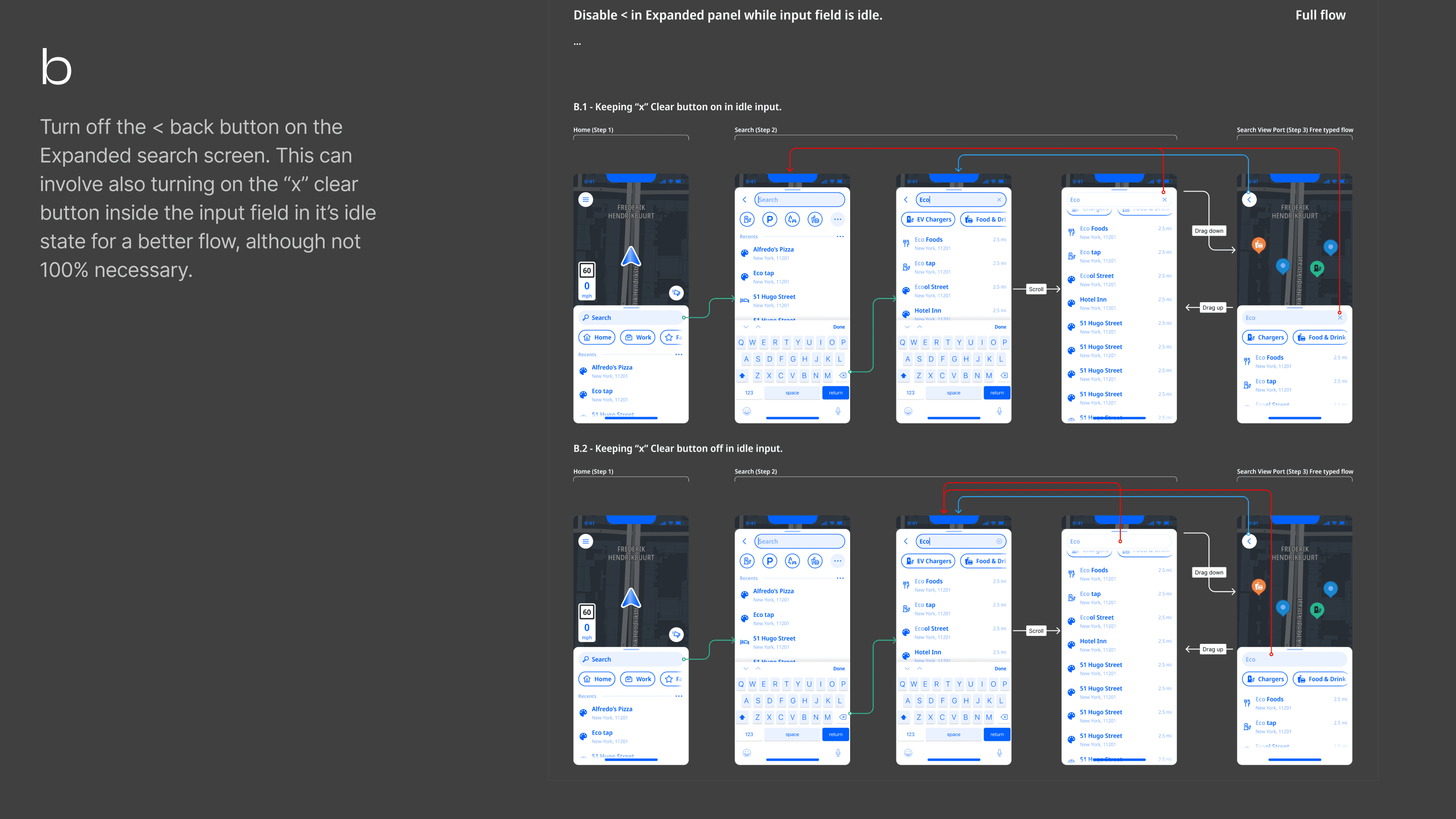
b) Remove the back button. Rely on the clear search input X. Doesn't solve it for Android users with a system back button. Designing around the problem.
c) Visual differentiation. Create a new step in the journey and make the two states visually distinct -- different screens, different visual patterns. This was my preferred solution as it would make the back button behaviour self-evident to the user while being a cleaner solution from a systems point of view.
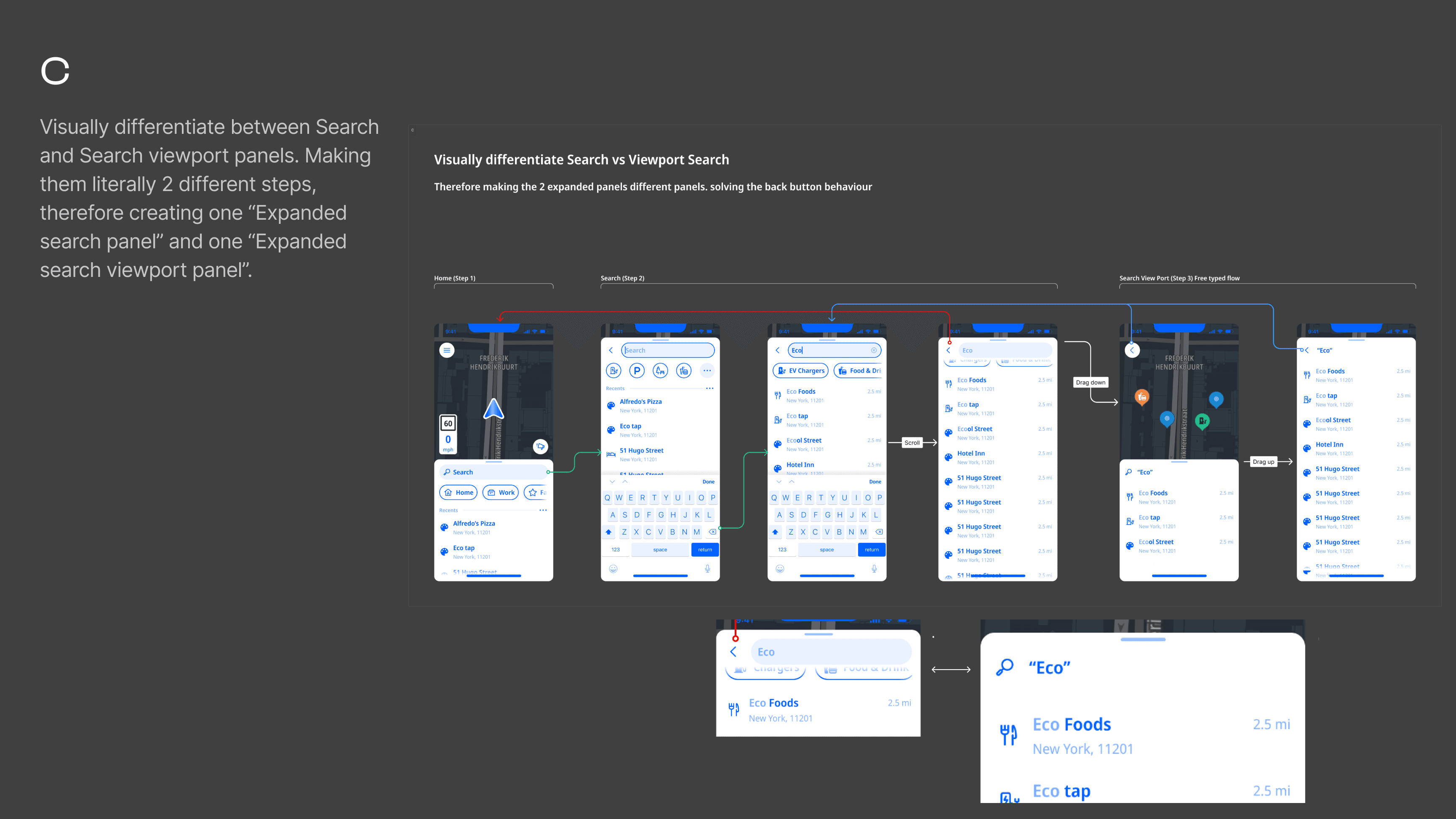
What shipped
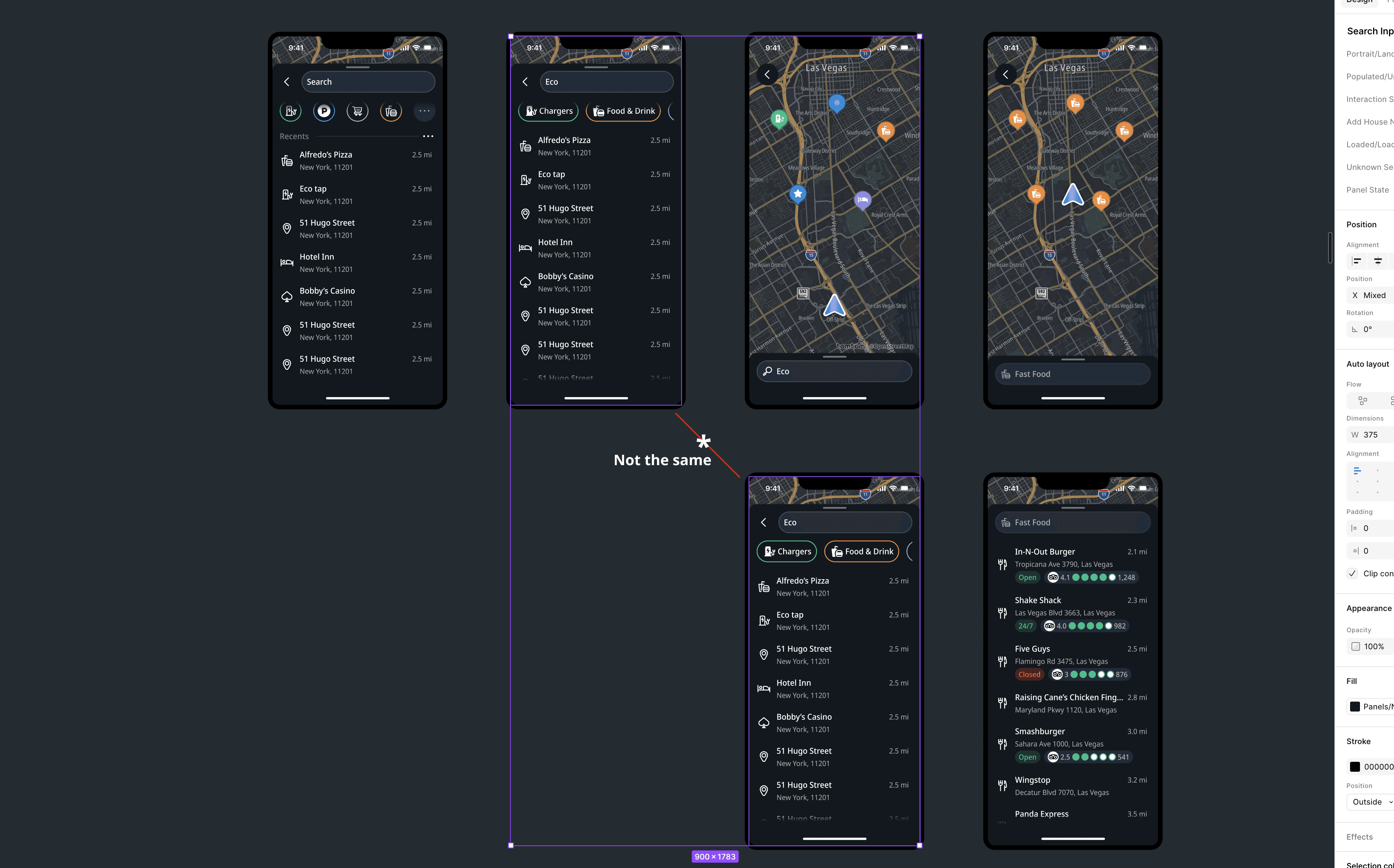
Engineering pushed back on implementation cost of option C. The solution was to duplicate the existing screen in a structural refactoring making the two panels separate screens in the navigation stack. Visually identical, architecturally distinct. Correct navigation behaviour without conditional fragility.
Rethinking the interaction model
The bug was the symptom. The gestures were an equally important part of the problem. The existing model had a structural asymmetry: dragging the panel down went deeper into the flow, but dragging up didn't take you back. Users could reach the viewport state without intent while it didn't add much value to their flow.
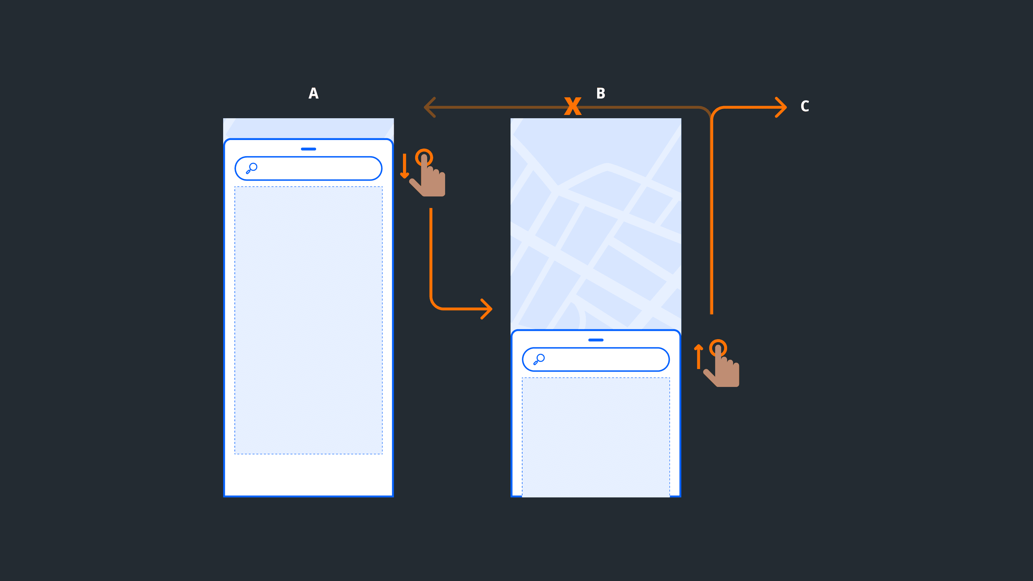
Navigation interaction Proposal
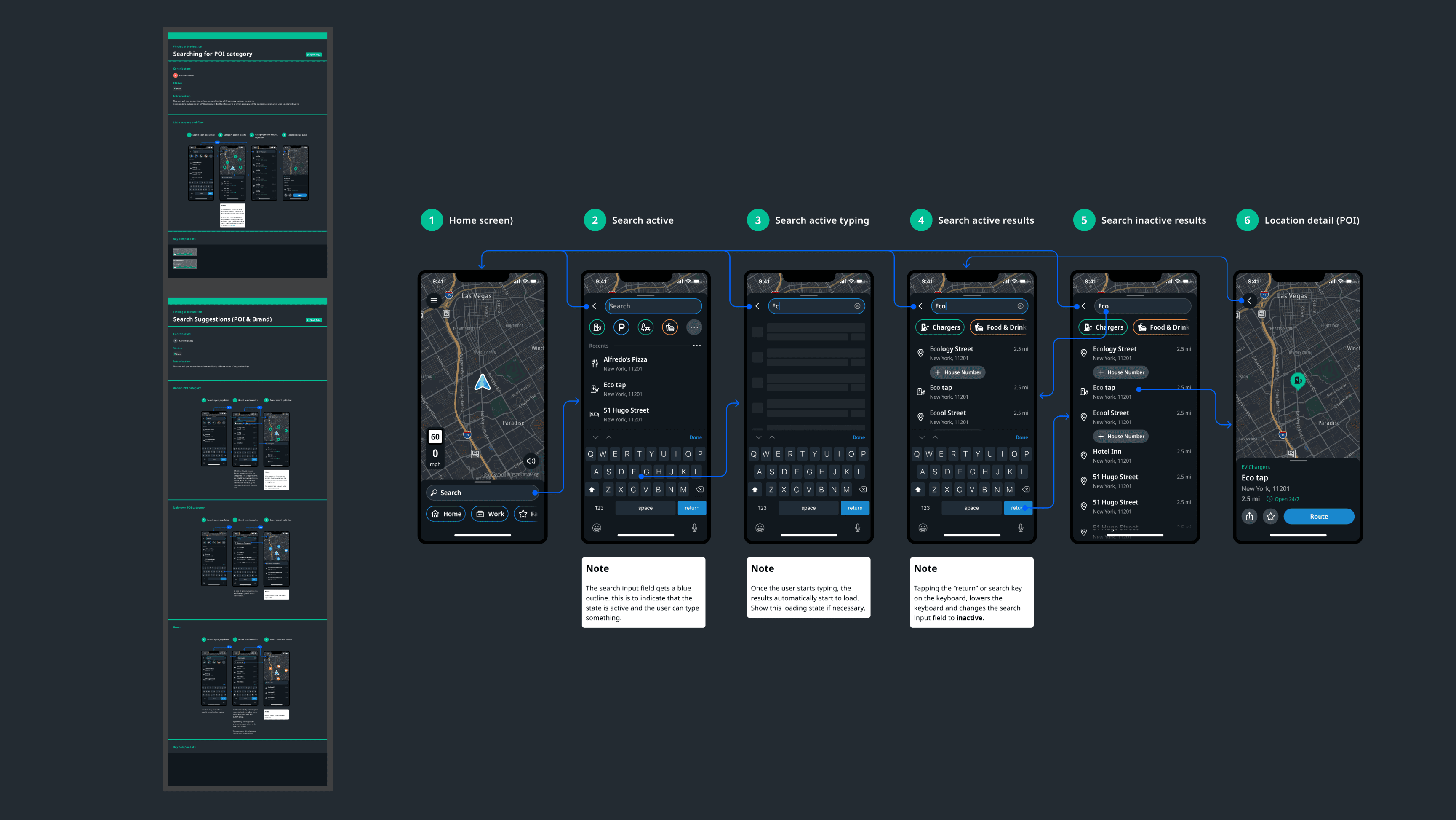
I proposed two changes: dragging down dismisses the search flow entirely; tapping Return commits the query and takes the user to the viewport. Both patterns are used by Apple Maps and Waze.
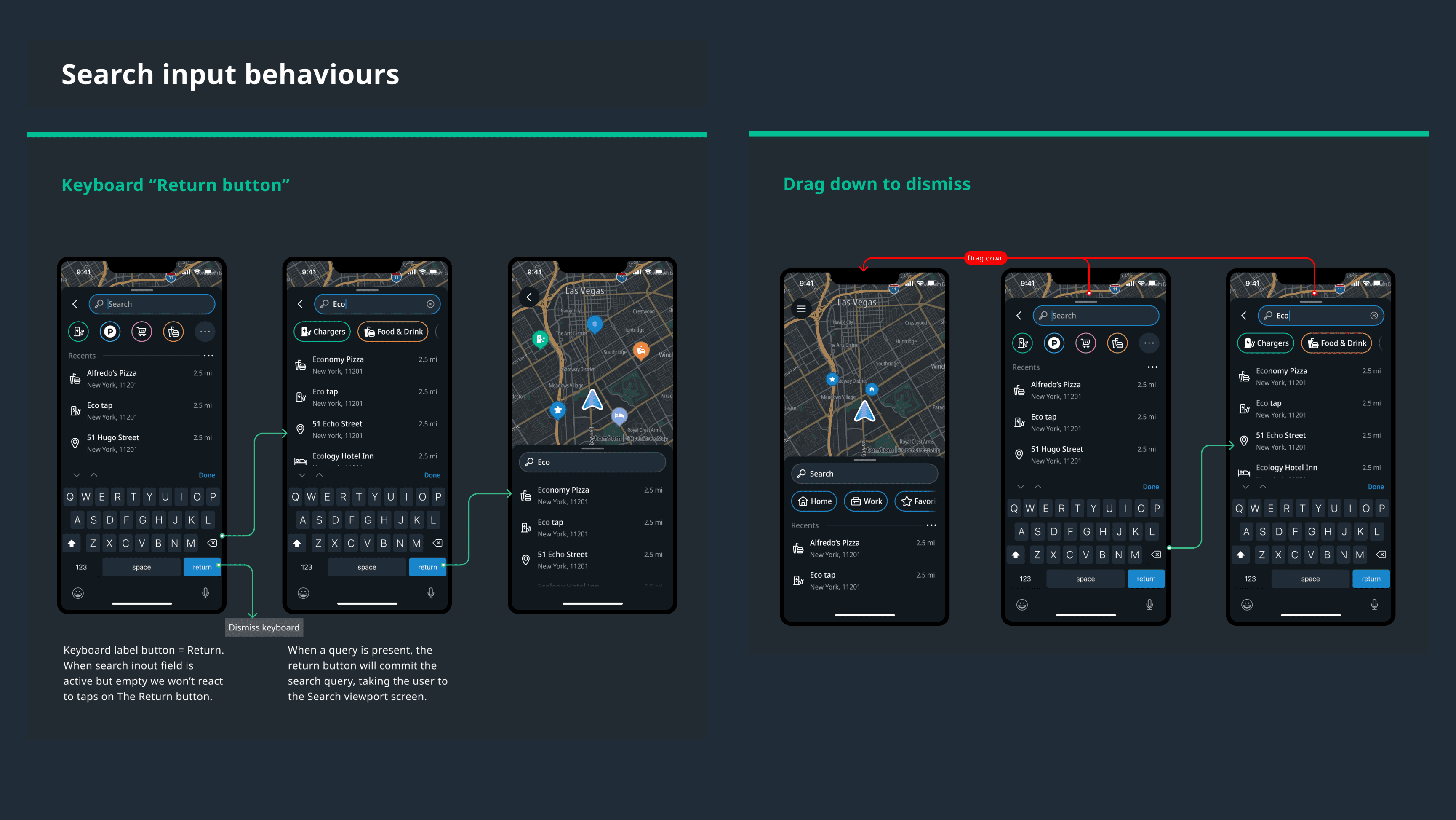
Pushback
In design critiques, other designers pushed back in favour of continuity with Amigo. My position was that a new product shouldn't inherit a structurally weaker interaction model from the app it was replacing. Both changes shipped.
Specs
We saw the need to go deeper in two aspects of our specifications: Provide general navigation pattern specs and explicit diagrams of all existing flows as well. The later would later prove costly in terms of design overhead when updating the screen components on subsequent design iterations.

Edge Cases
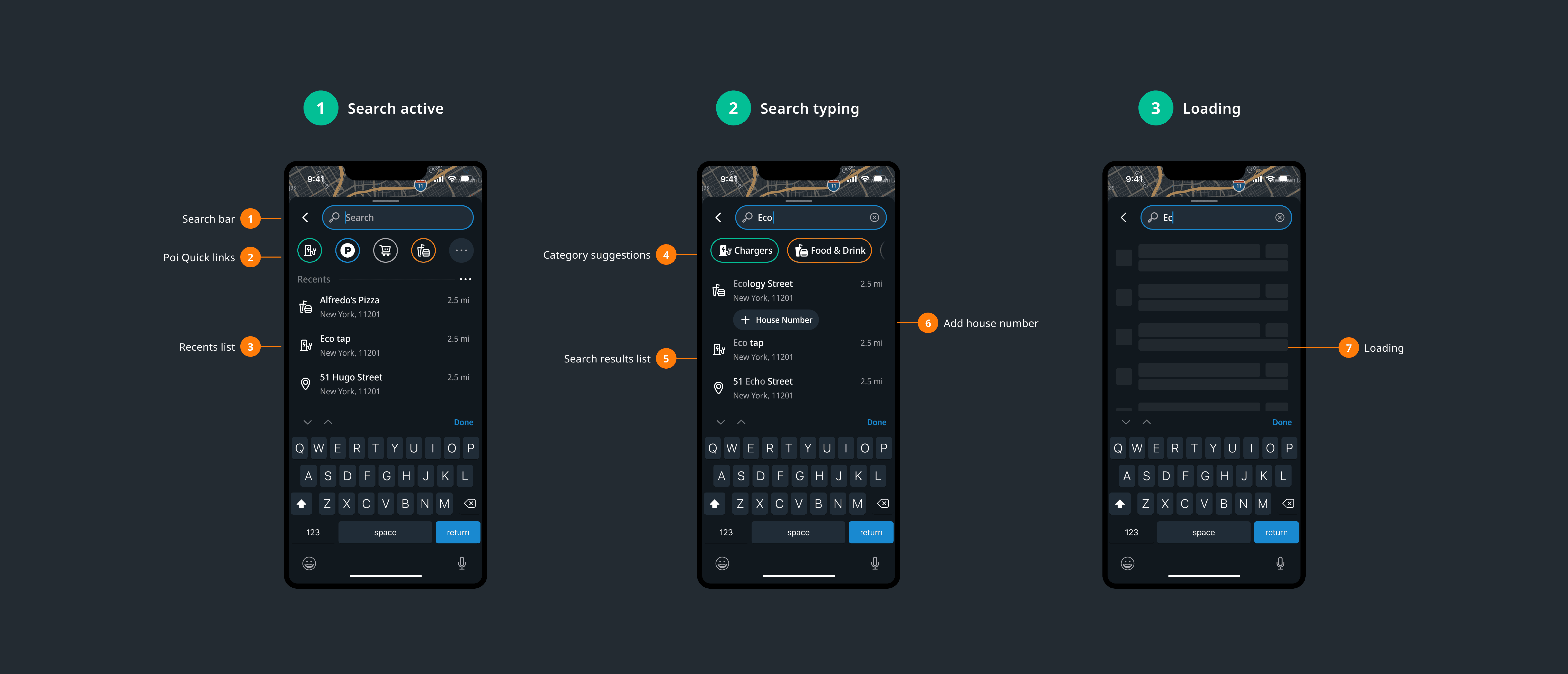
Error and empty states. No results, no connection, empty on first open, filters returning nothing. Each response minimal and actionable.
Truncation. Clear rules across all result types and views. No result breaks the layout regardless of label length.
Filter edge cases. Empty states communicate both the absence of results and the reason -- filters active, removable.
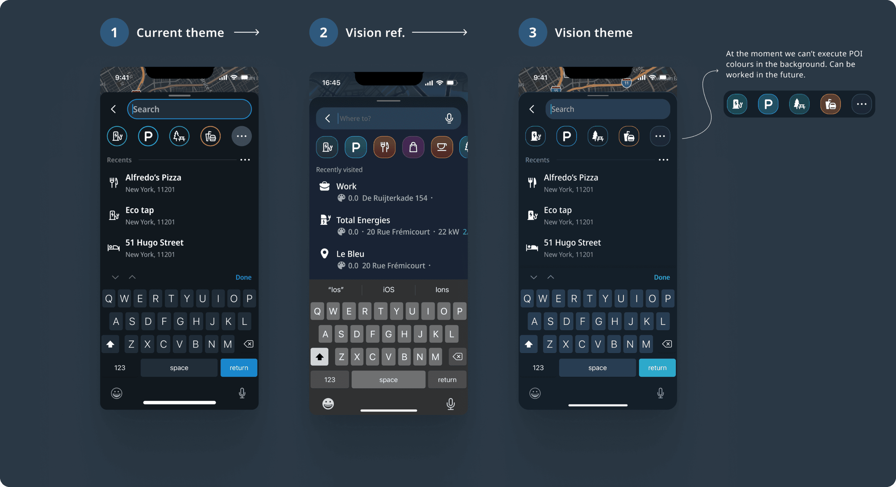
Landscape. Map always visible means search results rendering continuously creates an erratic experience. Deliberate decision needed on when results commit to the map. The original 50/50 panel split generated consistent feedback: users wanted more map. Solution: conditional width rule -- minimum 320dp or 40% of available screen width, with padding. More map on larger screens, functional on smaller.
What Shipped
Search complaints dropped out of the feedback channel.
Engineering had a cleaner foundation.
The gesture model aligned with patterns users already knew.
Evolution
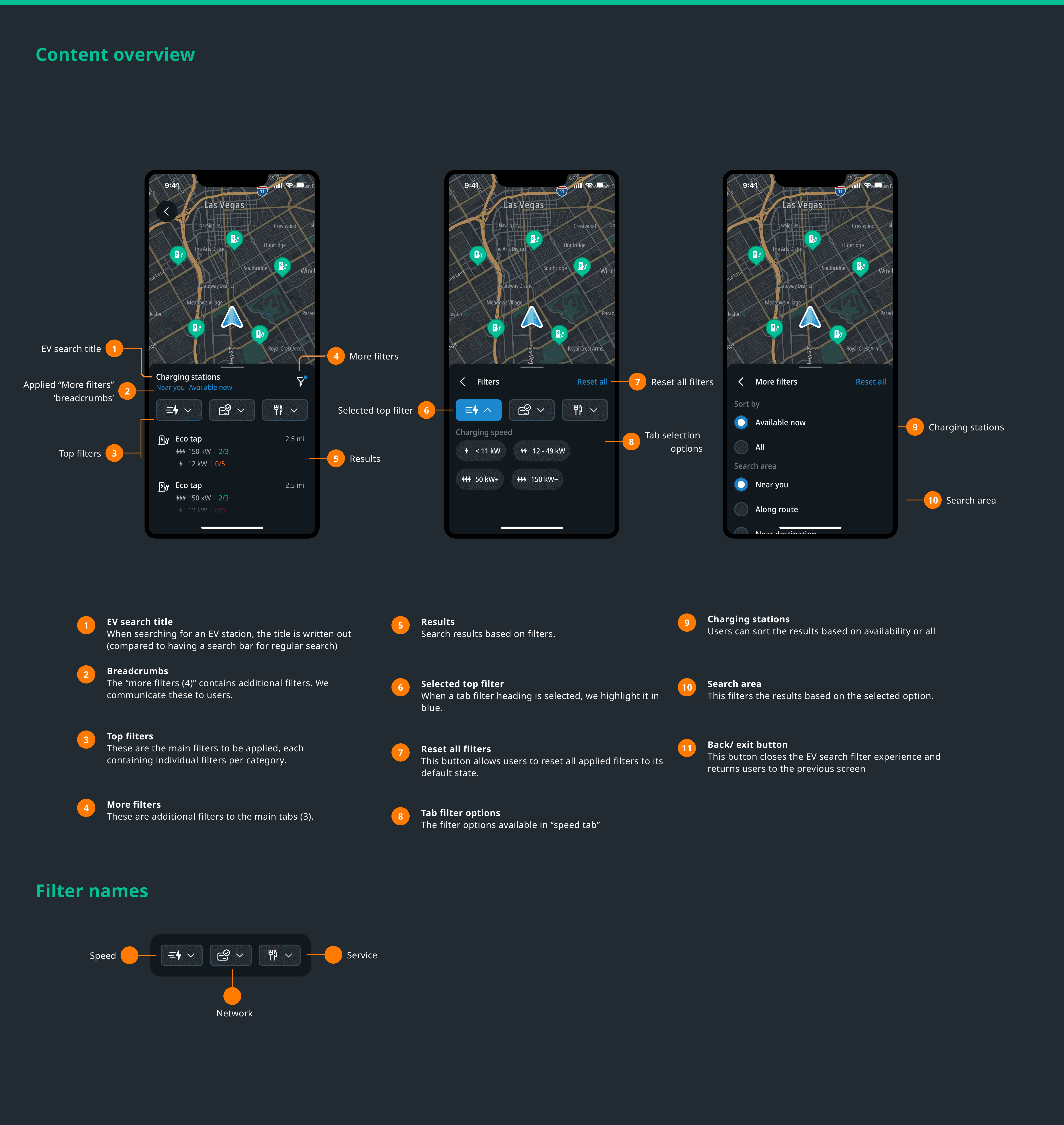
EV charging filters came first, then parking search, then TripAdvisor integration. A unified POI search system is in progress. I was involved throughout, with ownership on navigation interaction and UI.
When EV charging and parking search were designed, they naturally required a visually distinct viewport state. The pattern from my preferred solution came back.
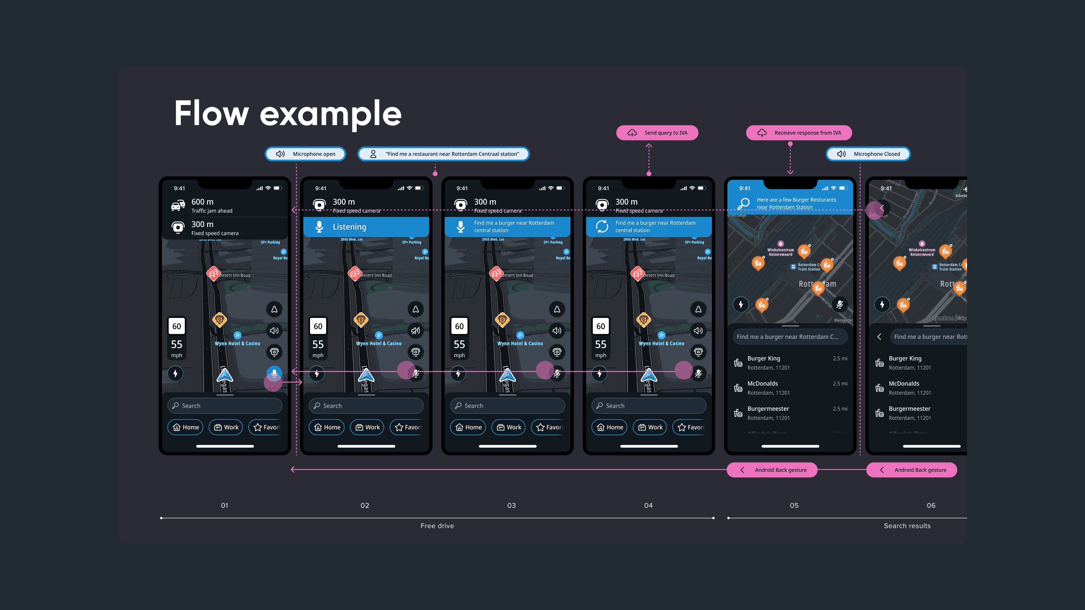
The most significant evolution: conversational AI search, in alpha when I left. Users wake the assistant hands-free -- "search for a burger place in Rotterdam" -- and get routed there. The vision extends to incident reporting, general queries, and settings by voice. I owned the UI, working with a staff interaction designer on the interaction model.
The next step is paying that visual debt, differentiated viewport state, motion quality that matches the interaction logic, and a UI that reflects where TomTom Maps is heading. The interaction foundation is there. The missing piece is visual.